The Psychology of Colour
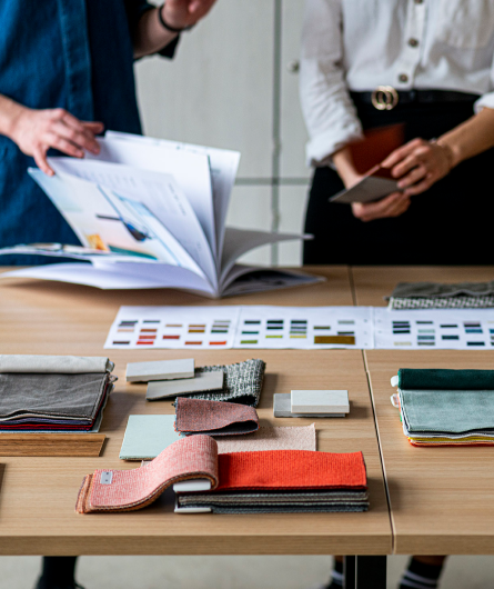
Colour has the power to rouse our emotions and affect our feelings, it is therefore possible to create the a certain atmosphere amongst people within an interior through colour.


In the 1920s, a pair of abstract painters were teaching at the Bauhaus, the highly influential German school of art and design, and living next door to one another on its Dessau campus. Their names were Wassily Kandinsky and Paul Klee. Their houses were built by the school’s founder, Walter Gropius, who notoriously disliked colour, with drab white and grey exteriors. The interiors, however, were a riot of colour; when the houses were later renovated in the 1990s, 7 different layers of paint and more than 200 shades were uncovered. Kandinsky’s living room, for instance, was yellow, pink and gold leaf.

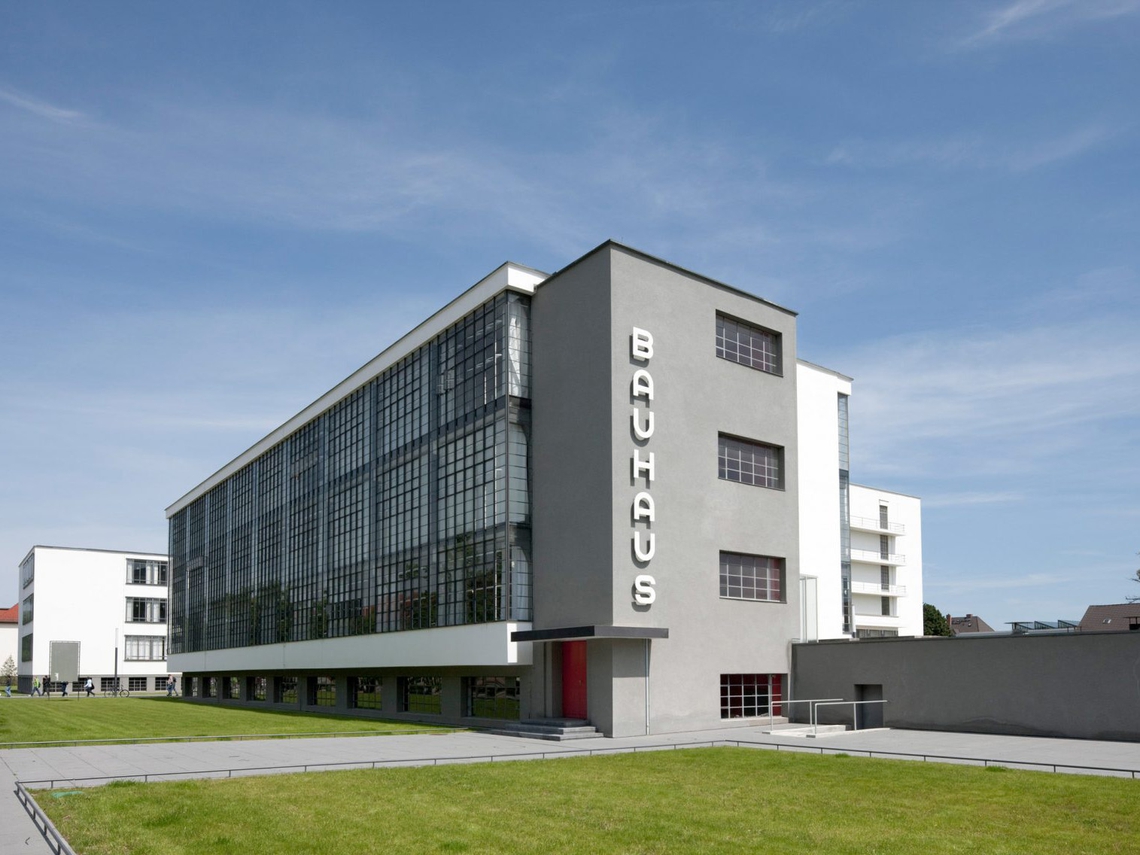
Together with artists Johannes Itten and Josef Albers, who also taught at the Bauhaus, Kandinsky and Klee would go on to invent the new field of colour theory. They believed that colour has the power to rouse our emotions and make us feel, which was a very powerful idea back then and remains so today. So, in this blog, we’re going to investigate the psychological effects of colour in the workplace.

Pantone’s Colour of the Year
In 1979, the researcher Alexander G. Schauss did a study of the effects of colour in prisons and found that painting the walls pink reduced incidences of aggressive behaviour. This was one of the earliest studies of the kind. Now, 40 years later, a peachy-orange shade of pink known as “Living Coral”, or Pantone 16-1546, has just been anointed Pantone’s Colour of the Year. The company describes it as an “animating and life-affirming coral hue with a golden undertone that energises and enlivens with a softer edge”. And furthermore, in keeping with Schauss’s findings, they say: “Sociable and spirited, the engaging nature of Pantone 16-1546 Living Coral welcomes and encourages lighthearted activity.” So this particular shade of pink is sociable and lighthearted. But what are the qualities of other popular colours used for interiors.

Warm and Cool Colours
Let’s go back to the Bauhaus, where, from 1919 to 1922, Johannes Itten was laying the foundations of modern colour theory in his logical, methodical manner. He was interested in how colours should be ordered, and which colours worked well together. He was also very interested by their psychological affects, and was one of the first people to explore and develop the idea of warm colours and cool colours.
Living Coral is, perhaps unsurprisingly, considered a warm colour. Other warm colours like orange and yellow are also thought to inspire joy and optimism and energy. However, it’s best not to overdo such bright shades because they reflect more light and so can over-stimulate our eyes.
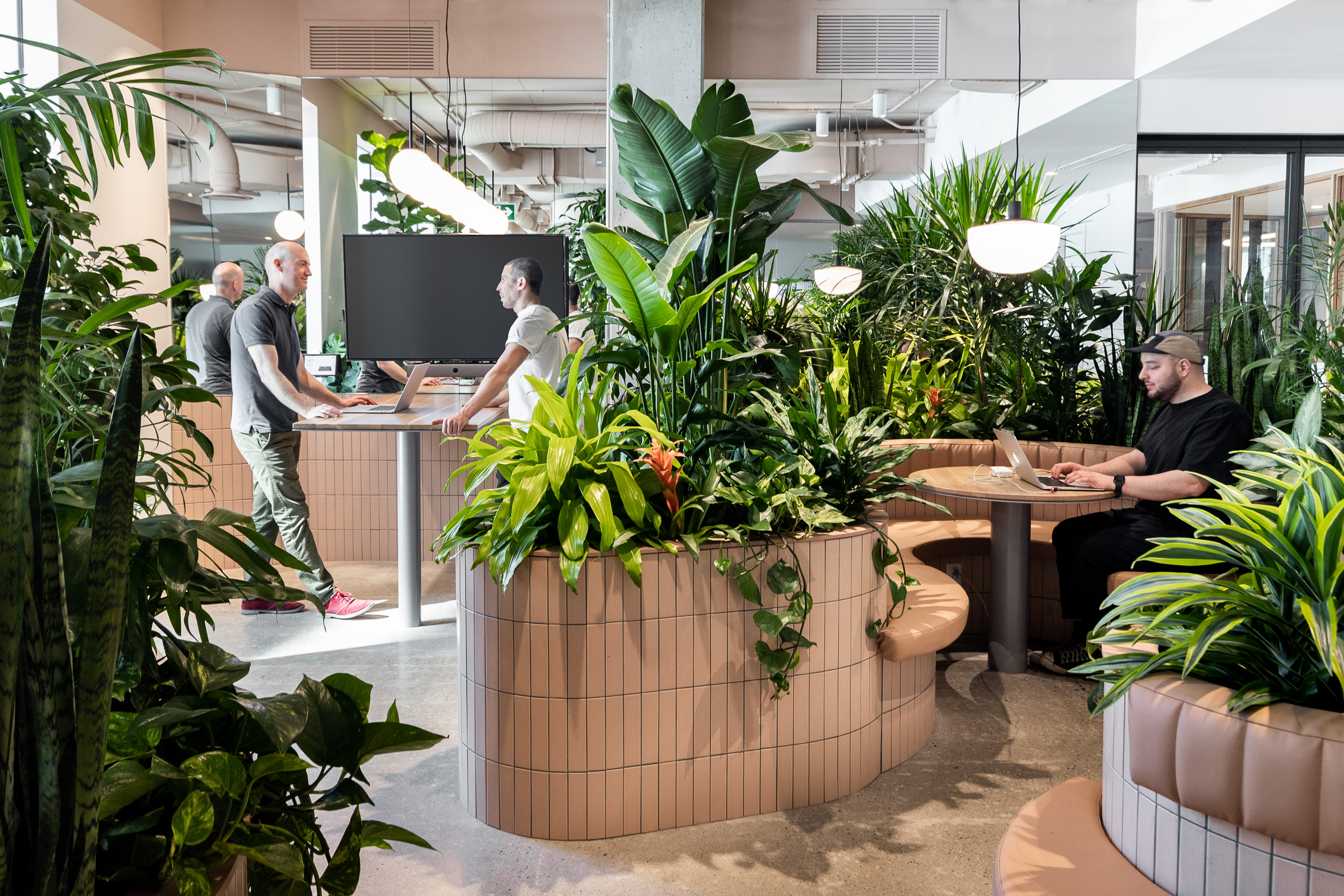
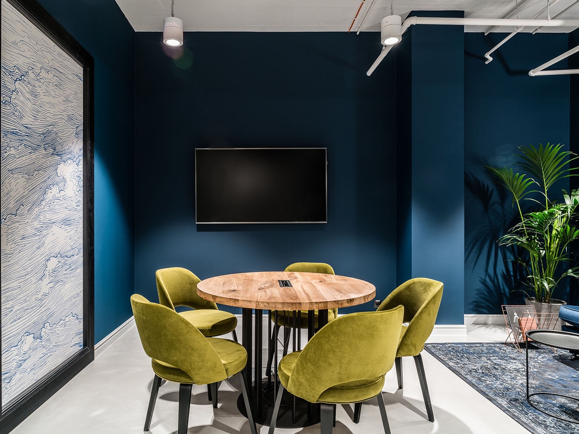
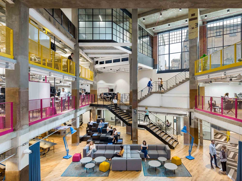
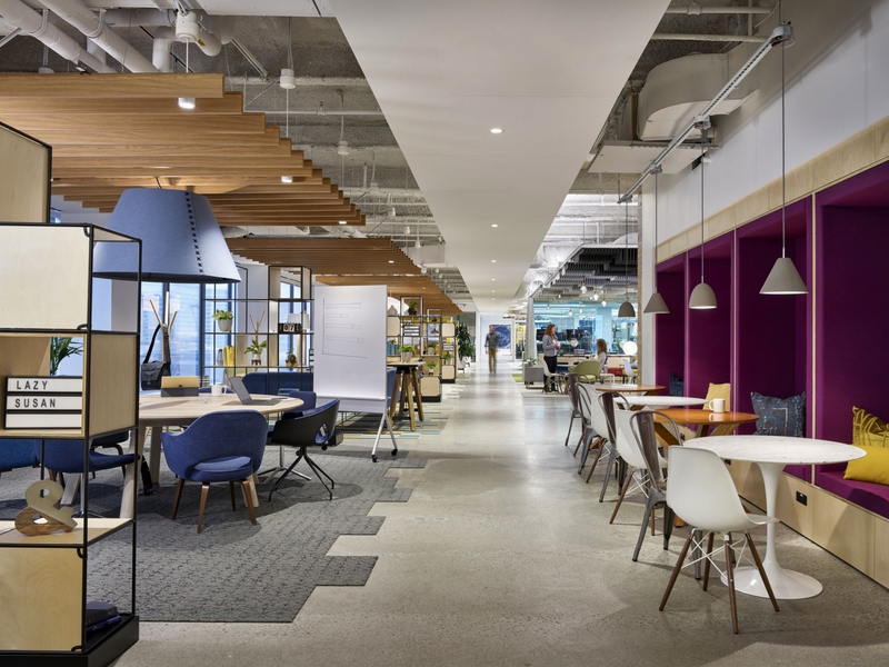
Colours like green and blue, by way of contrast, are thought of as cool: because we focus shades of green directly on our retinas, it’s less strainful on our eyes. They also both bring the natural world to mind. Green is evocative of meadows and woodlands, and blue of rivers and lakes, and so they contribute to the calming, restful effects of introducing plants and other biophilic elements into the office. Blue, in particular, is thought to slow down our breathing and lower our blood pressure, and is good for reducing stress.
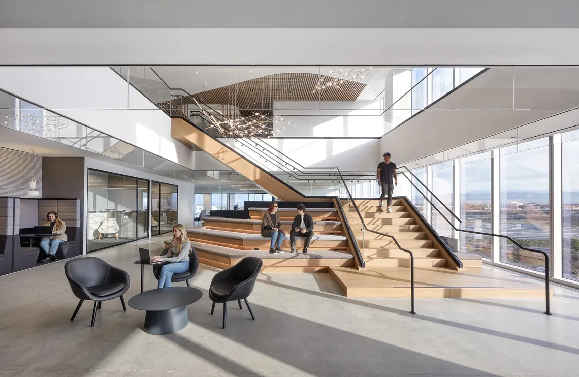
Colour In the Workplace
For Wassily Kandinsky, who was Johannes Itten’s successor at the Bauhaus, colours had spiritual qualities of expression. He likened these to musical notes; for instance, he thought that yellow was the equivalent to a middle C. Colours, for Kandinsky, could be worked up into great symphonies.
But colours, like songs, are highly subjective. While there are general rules – there’s such a thing as a happy key and a sad key, and there’s such a thing as an energetic colour and a calming colour – the same song can still mean completely different things to different people. So can a colour scheme. You can’t expect everybody to feel the same in any given environment. So, just as it’s important to offer a variety of kinds of workspaces in an office, it’s good practice for these workspaces to have colour variation to give people a choice. There’s no such thing as the “right” colour for an office. To quote Johannes Itten: “He who wants to become a master of colour must see, feel, and experience each individual colour in its many endless combinations with all other colours.”

_medium.jpg)
_small.jpg)
Distributeur de vêtements, Boden ont découvert une façon habile de moderniser les 8500m² de leur siège social pour répo…
VENTE AU DETAIL
La société d'impression de photos en ligne Photobox Group a récemment demandé aux experts en design de l'espace de trav…
FABRICATION
Un fournisseur de services financiers important situé à Boston, Massachussetts a collaboré avec Jacobs, Officeworks et …
SERVICES FINANCIERS