Colour Trends 2020
What will the most important colour trends be in 2020? We consulted some of the world's leading colour forecasters, who've been talking to culture industry experts to find out...


What are the most important colour trends going to be in 2020? We consulted some of the world’s leading colour forecasters, who’ve been out there talking to culture industry experts, business leaders, youthful influencers, interior designers, fashion designers, artists, and many others in the know, to find out.
According to WGSN’s Colour Director Jane Monnington Boddy, next year “will be the moment when we look forward more than we look back. … Colours are optimistic and versatile, and also highlight colour becoming inclusive. The days of brights being for youth consumers or pastels being for women are over. It’s time to take a more inclusive approach to colour and design your palettes with an awareness of their broader appeal.” So, as we roll over into a bright new decade, here are five key colour trends to bring into your home and your workplace.

Neutral Canvas
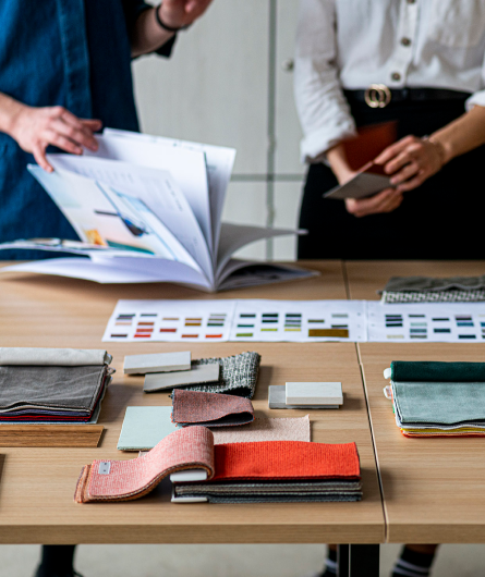
Soft, natural neutrals like Cotton, Twine and Putty are familiar and homely. They create a mood of authenticity and comfort. Furthermore they provide a versatile foundation for interesting colour contrasts; particularly when paired with cooler, darker shades.

Cool Shadows
Again these shades are natural, and evoke authentic, traditional materials, but they’re also more heavily shaded. Darker colours like Slate, Graphite and Bay have a muted feel that evokes the natural world and pairs well with other deep colours.

Layered Reds
Red is always a powerful, passionate colour. Next year’s likely to bring a move away from sweet pinks to more mature tonal reds. Kiln Red, Tinned Salmon and True Coral are all great for building bright, warm layers. And, once again, they bring some of nature’s glory inside.
Purple Tones
Deep purples are just as rich and warm and natural. They’re grown up, and good for building bold layers with. Our particular favourites include the earthy, grounded tones of Clay Pink, the plum Damson, which brings to mind an English country garden, and bold, delicious Grape; the perfect accompaniment for relaxing glass of wine to unwind with.

Monochrome Shades
Lastly, don’t forget the importance of pure, graphic monochromes against which to contrast all this colour. We like Primer Grey as a base tone, Gloss Black to add some definition, and bright Enamel White for a crisp burst of clarity. After all, sometimes nothing looks better than a calming white wall.


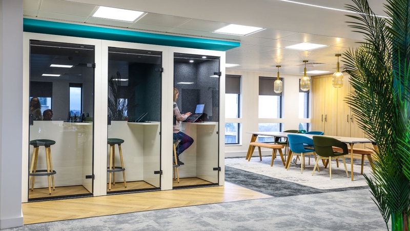
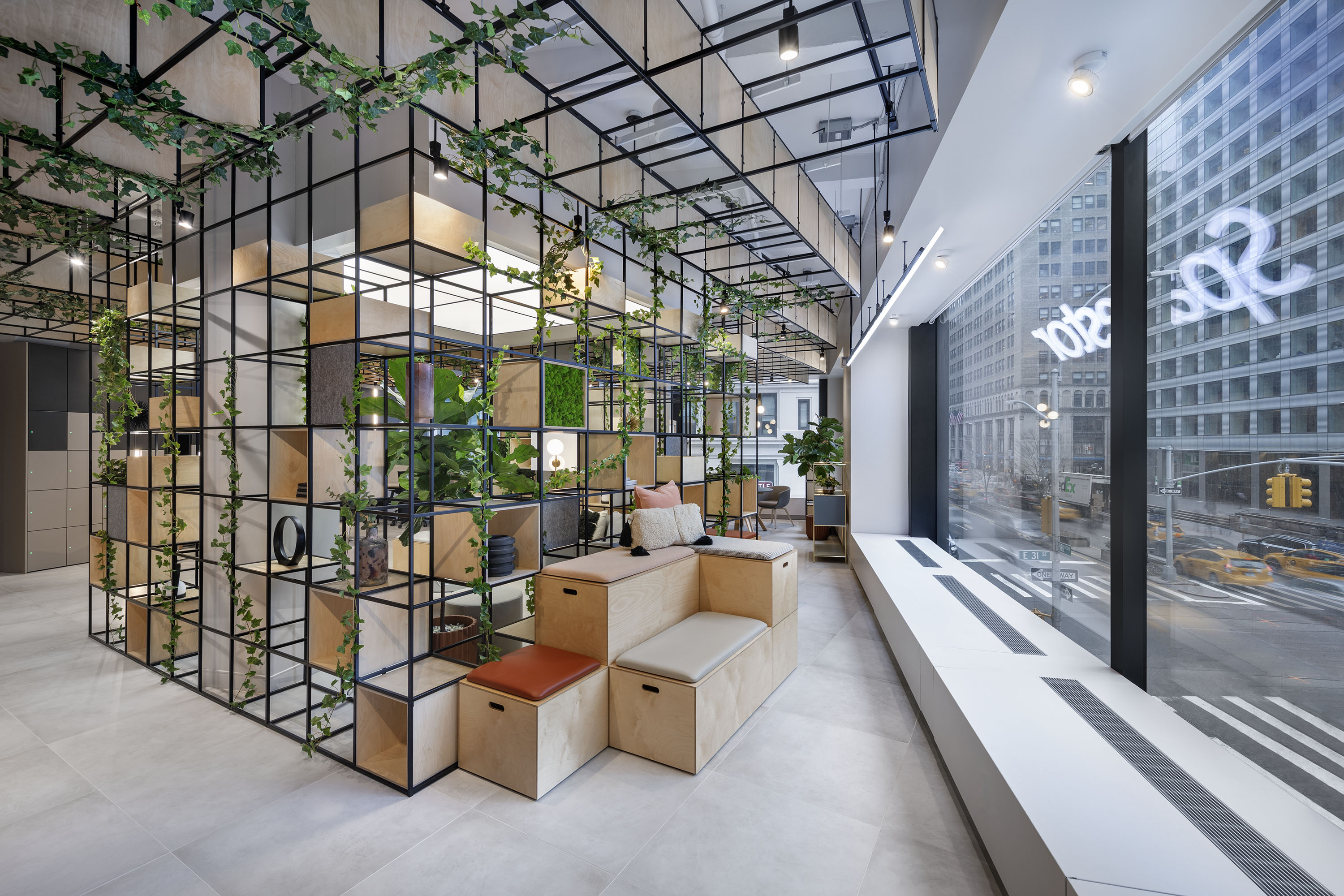
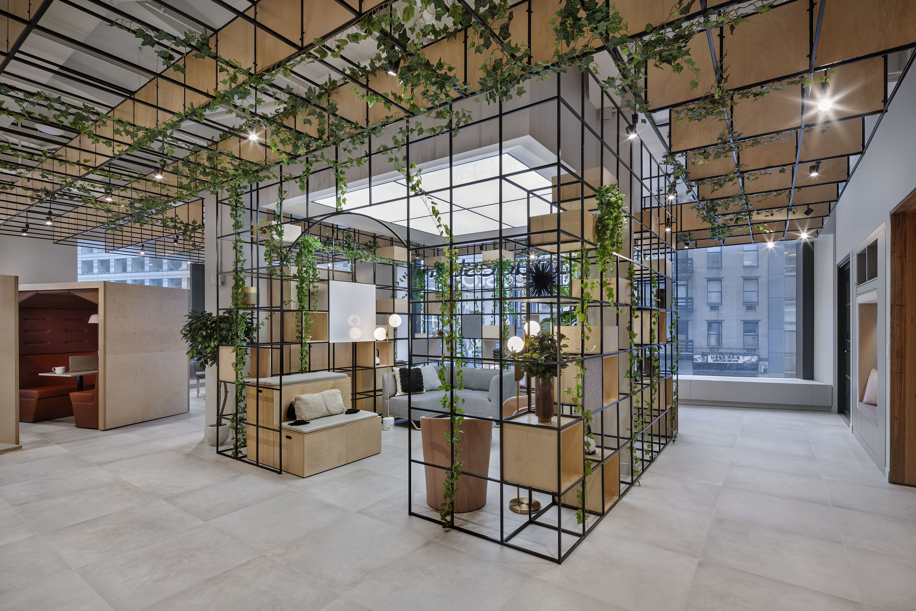
Bringing the company together in the heart of Manhattan's financial district, Booking.com have recently relocated into …
PROFESSIONAL SERVICES
For their headquarters in Seattle, online real estate company Zillow Group have transformed their new offices into a po…
REAL ESTATE
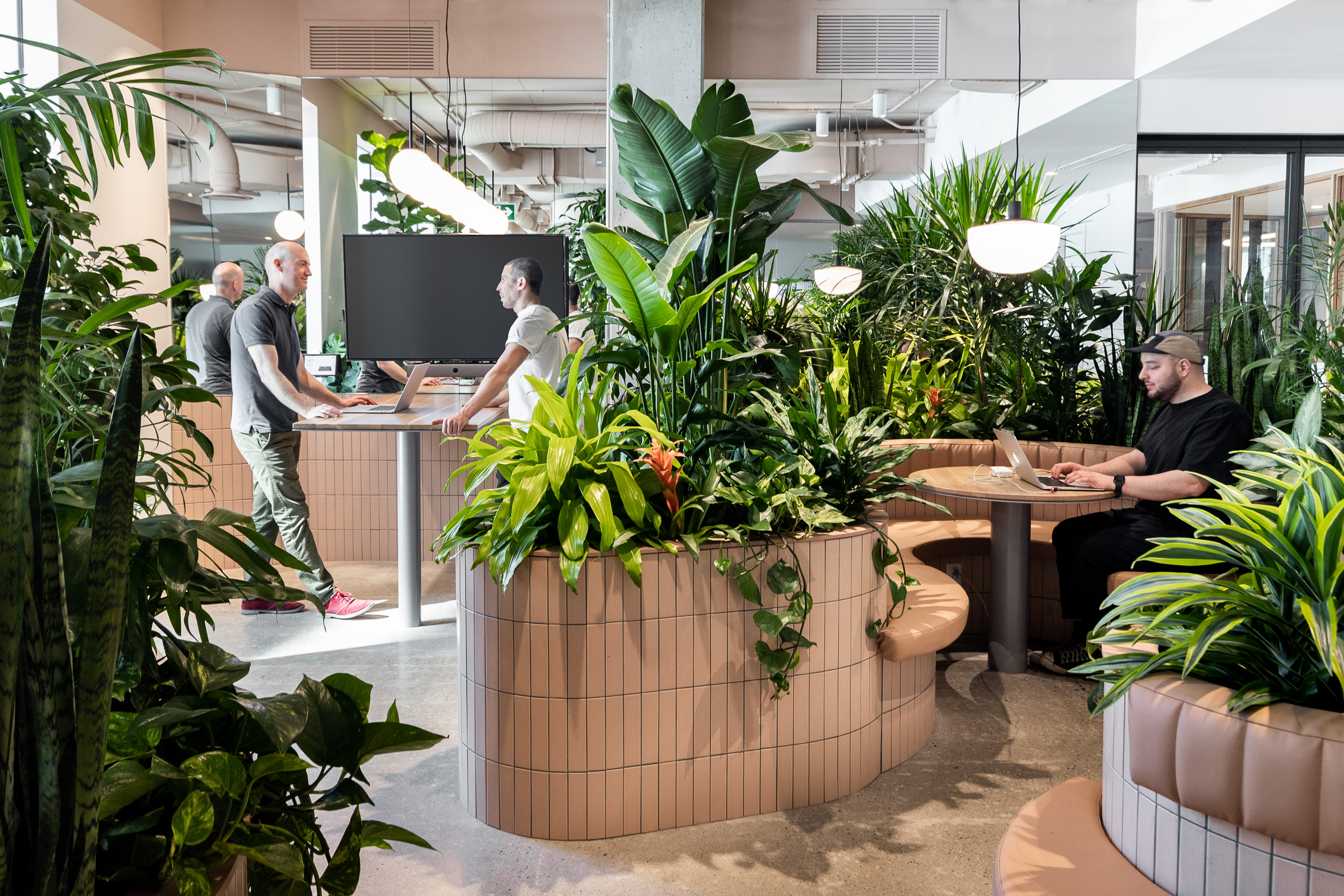
A leading financial company has recently moved into its new headquarters in Dublin, working with Walls to Workstations …
FINANCIAL SERVICES