18 Oct 2017
Industry Trends
Introducing the first designer of our Creating the Cool series...
Graphic and environmental designer Deborah Sussman (1931–2014) is renowned not only for her mastery of colour but also for the way she applied graphics to interiors, exteriors and even whole cities, dressing them up so that they looked quite magical.
Born in Brooklyn, New York, her earliest drawing lessons came from her father, who worked as a newspaper artist. In the summer of 1948, right after graduating from high school, she attended the legendary Black Mountain College alongside the likes of composer John Cage, choreographer Merce Cunningham and abstract painter Franz Kline. Afterwards she went on to study graphic design at the Institute of Design in Chicago, which was run by Bauhaus photographer László Moholy-Nagy at the time.
And then in 1953 she moved to Los Angeles to intern with designers Charles and Ray Eames at their renowned Venice Beach office; in other words, she learnt her trade alongside some of the most creative designers and artists of her time, which perhaps helps to explain how she’s gone on to be such a great influencer herself.

Deborah Sussman
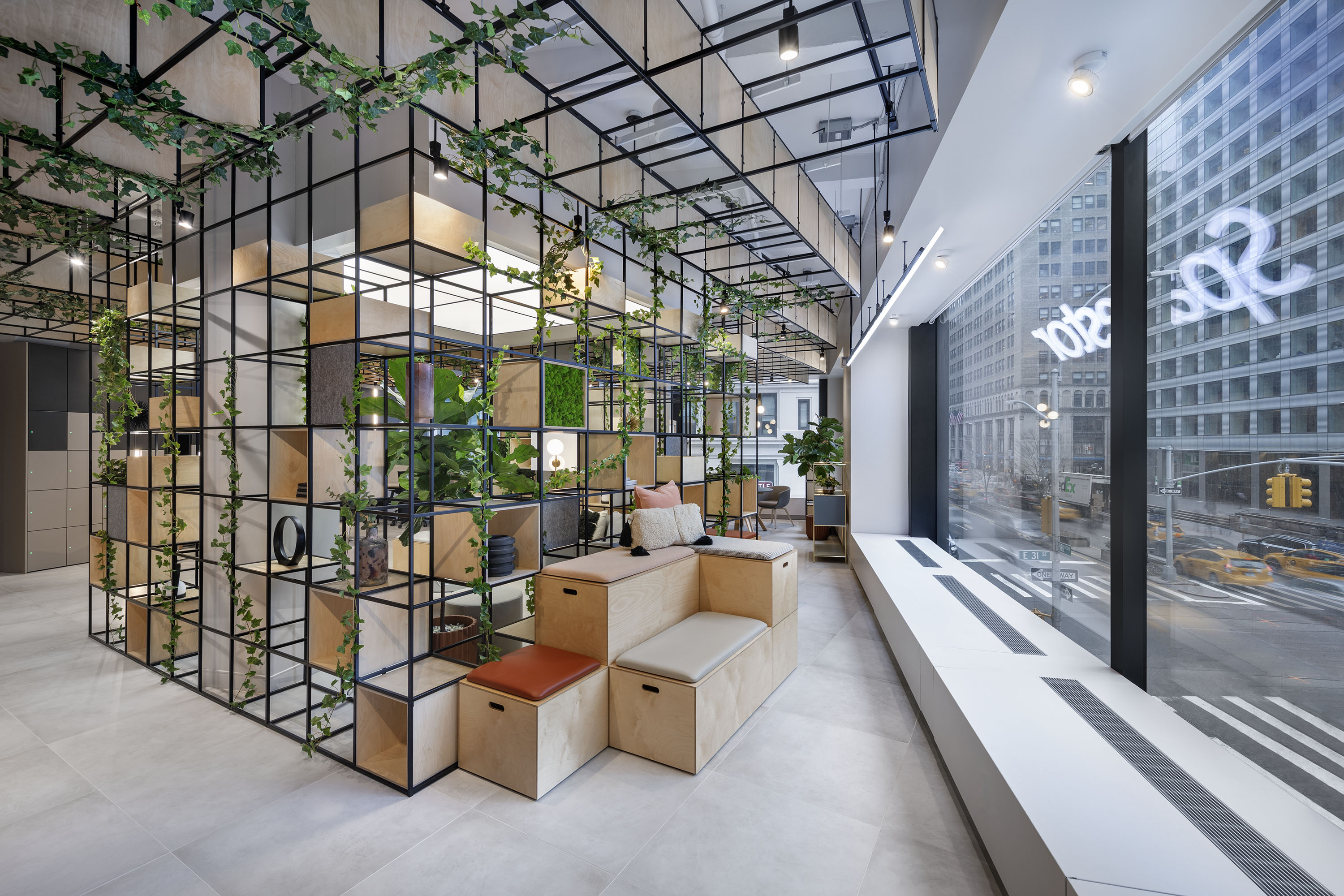
In 1968 she founded her own practice, Deborah Sussman & Company, and one of her most notable early projects was making the stunning interiors for Standard Shoe Stores. These shoe stores looked like a dream, like a 1960s pop art explosion in vivid and unforgettable colours. And even at this early stage, Sussman was working across disciplines, collaborating with all sorts of creatives, and designing without boundaries.
Standard Shoe Stores interior
Standard Shoes Store environmental graphics
After marrying the architect Paul Prejza in 1980 she rebranded her practice Sussman/Prejza , and it was under this name that she completed her masterpiece, the joyful, prismatic visual identity of the 1984 Los Angeles Olympics. In the words of Guardian architecture critic Oliver Wainwright: “Saturated with a supercharged rainbow and screaming with psychedelic joy, the 1984 Los Angeles Olympics looked like what might have happened if Willy Wonka had turned his hand to urban design.”
Los Angeles Olympics 1984
Once again, colour was absolutely central to the design. Inspired, in particular, by her experience of working in Mexico on the Eames’s 1957 film “Day of the Dead”, and in India on their 1965 exhibition about the country’s prime minister Jawaharlal Nehru, Sussman wanted a vibrant palette that would reflect Pacific Rim cultures like Mexico, India, Japan and the United States; eventually she settled upon a daring combination of magenta, vermillion, aqua and chrome yellow. Sussman’s bold use of colour is a huge inspiration. “There are millions of colours,” she once said. “Picking the right ones is a challenge I just love.”
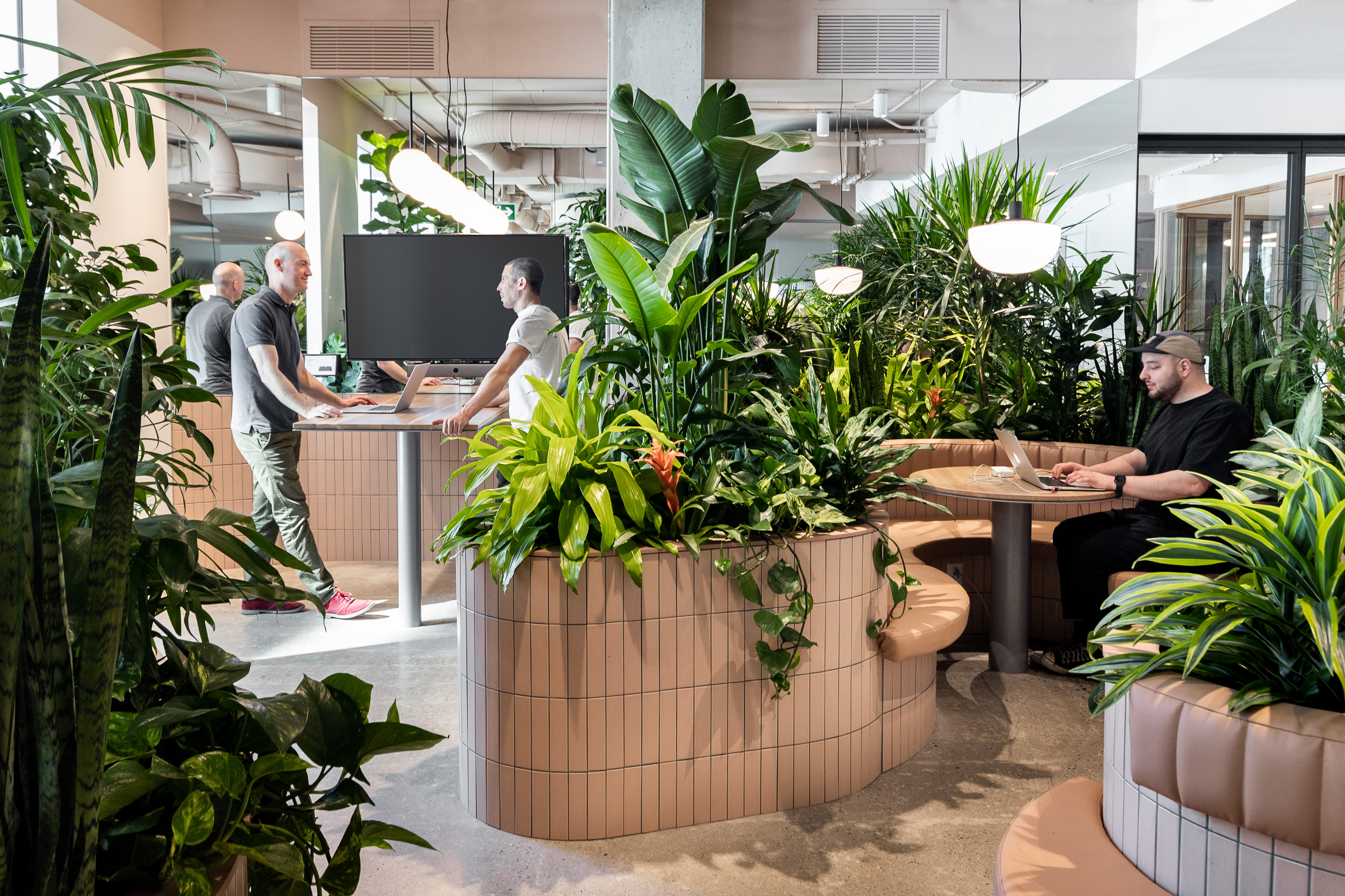
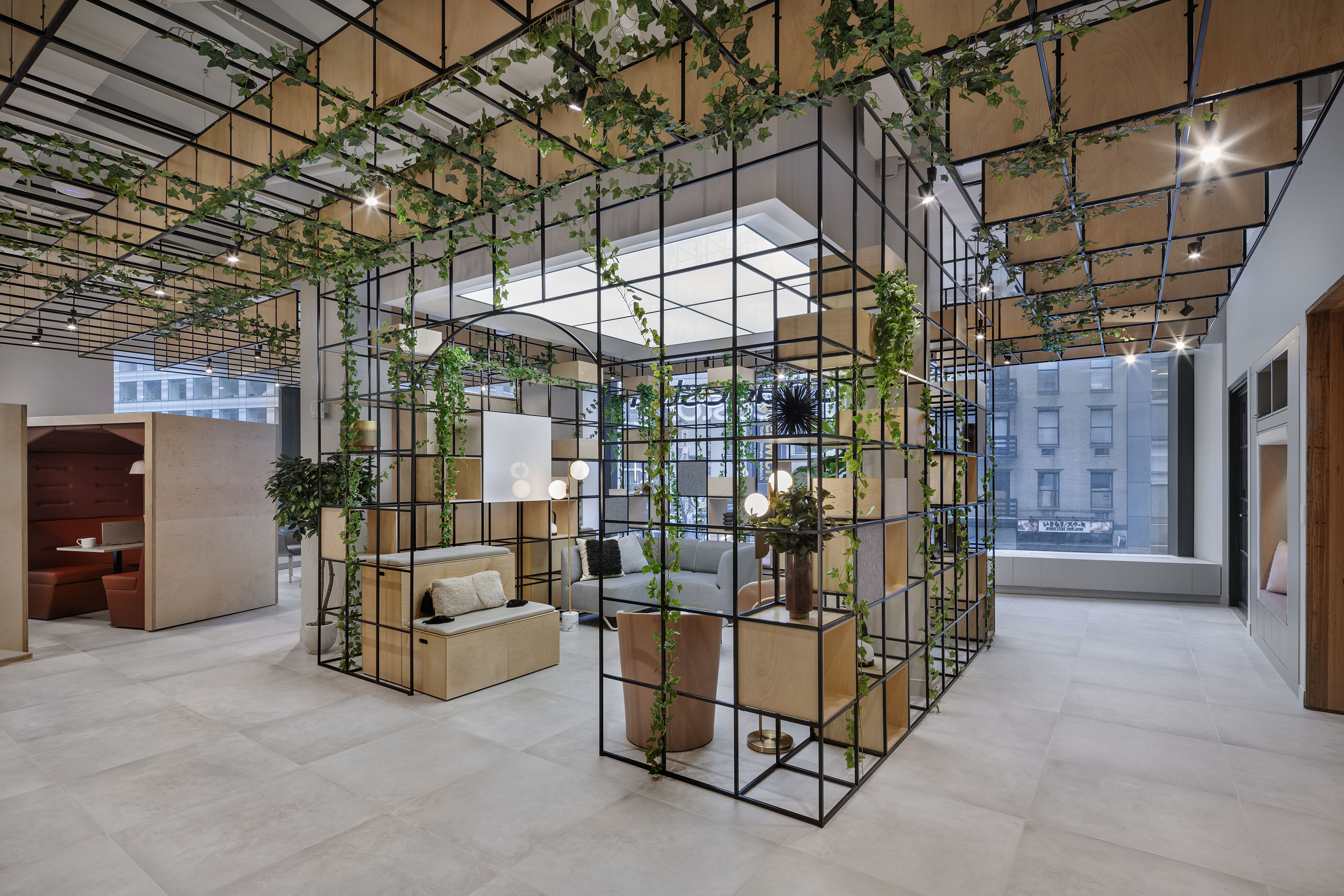
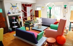
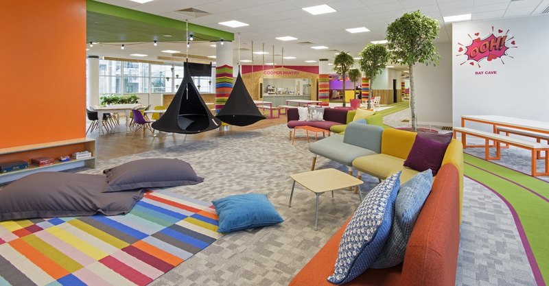
Here at Spacestor we couldn’t agree more. Not only do our products come in vibrant ranges of colours, we also love working with clients to customise pieces for their offices, making sure that colours and finishes reflect the brand identity perfectly. After all, a beautiful colour can really brighten up your day. We’ve always been influenced by Californian design, and few designers are as representative of the Golden State’s culture of freedom, and its bright joie de vivre, as Deborah Sussman. She makes design fun – as it should be. For example, her memorable signage for Disney World and Euro Disney features Mickey Mouse ears poking playfully above street signs, and helps to conjure up that feeling of magic even before guests have arrived.
Sussman and her collaborators designed a “kit of parts”, or a sort of visual alphabet to spread across the whole city: 43 artwork sites, 28 games venues, 3 athletes’ villages and all the wayfinding and signage in between. It’s gone down in history as one of the most iconic Olympic games, and its branding was even named “Best of the Decade” by Time magazine.
Disney World signage by Sussman Above all, we’re great admirers of her extroverted personality and daring approach to design. Her friend Leslie Gallery Dilworth, who hired her to work on wayfinding for the city of Philadelphia, says, “To select a yogurt was a design experience. To arrange the jellies for breakfast was a design opportunity. Going shopping for eyeglasses was beyond adequate description!”
She also recalls that Sussman kept a card file of notes about what she wore to every one of her meetings with clients: “When I asked her why in the world she did that, she said she never wanted to wear the same thing twice!” Deborah Sussman was a bubbly, colourful character who lived and breathed design. We feel much the same: design is a way of life, and every detail matters, even the ones you might not think of.
Sussman - a design spectacle
Follow us on Facebook , Twitter and LinkedIn to keep up to date with this design series.
Share this article