2 Nov 2017
Industry Trends
One of the great American graphic designers of the 20th century, Saul Bass (1920–96) reinvented Hollywood title credits whilst also dreaming up movie posters, album covers and corporate logos for the modern world. His rare talent for combining iconic forms and bold colours in order to convey a powerful message remains an inspiration today.
His Shapes
“I want everything we do to be beautiful.” Saul Bass Born in the Bronx, in 1920, to Jewish immigrant parents, Bass began studying part-time at the Art Students League while still a teenager. Next came night classes at Brooklyn College, where was taught the principles of Bauhaus design by another recent immigrant, the Hungarian artist György Kepes. And then in 1946, having completed his studies, he moved to Los Angeles and founded his graphic design firm Saul Bass and Associates.

Saul Bass & Associates featured in IDEA magazine
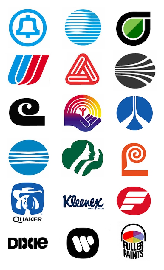
In the decades after the war, American brands were flourishing as never before and bringing graphic design up with them. Given his mastery of minimalism, symbolism and colour, Bass was ideally positioned to come up with logos for them. His most famous designs included Continental Airlines’ red “jet stream” logo (1968), AT&T’s blue globe logo (1983) and Kleenex’s homely, cursive logo (1980s), amongst many others that are still in use today: his logos have an extraordinary average lifetime of 34 years and rising. Here at Spacestor, we’re huge admirers of the deceptive simplicity of his touch; his designs may be simple, but they’re effective, and they last for a really long time.

Bass's logo designs
His Movements
‘‘Try to reach for a simple, visual phrase that tells you what the picture is all about and evokes the essence of the story.” Saul Bass Back in Los Angeles, it wasn’t long before Bass’s signature style of paper cut-outs and bright colours caught the eyes of Tinseltown. At first he was designing movie posters, but soon he was coming up with a whole new approach to title credits. For “The Man with the Golden Arm” (1955), starring Frank Sinatra and Kim Novak, he created a graphic silhouette of a junkie’s arm in keeping with the story’s dramatic themes. In the following years, having invented his own “kinetic type”, he sent letters dancing across the titles of Alfred Hitchcock films such as “Vertigo” (1958), “North by Northwest” (1959) and “Psycho” (1960).
Nothing like this had ever been done with titles before; and it’s this willingness to break with formal expectations that makes Bass such an important influence for us. When he started out in the 1950s, movie titles were considered so uninteresting that they were projected onto the closed curtains of the theatre. But when Bass had worked on a film, the reels would be delivered to cinemas with a special note: “Projectionist – pull curtain before titles.”
His Colours
But if there’s one Bass design that’s influenced us more than any other … it’s the record cover he dreamt up for “Frank Sinatra Conducts Tone Poems of Colour” (1956). As he’d worked so well with Sinatra before, designing the poster and titles for “The Man with the Golden Arm”, Bass was first choice to create the visuals for this (rather unusual) concept album of modern compositions inspired by different colours, and he certainly didn’t disappoint.

Tone Poems of Colour (1956)
His beautiful arrangement of bars of colours, with its warm, visual harmonies that are evocative of music, took much of its inspiration from the modern abstract art of the 1950s; and we, in turn, have long been inspired by his harmonious, symphonic approach to colour schemes, which, like all of his best work, is so simple that one wonders how nobody else had thought of it before. “Design,” as Saul Bass once said, “is thinking made visual.”

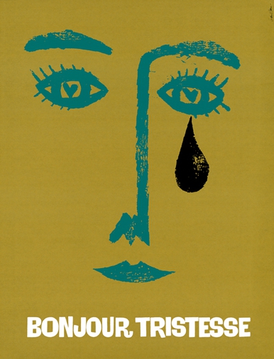
Bonjour Tristesse (1958)
Follow us on Facebook , Twitter and LinkedIn to keep up to date with this design series.
Share this article


