Thanks for stopping by! This is the place where you'll find all you need that makes up the
Spacestor brand.
Wordmark
We have two core versions of the Spacestor wordmark: black and white. Both are needed to
maintain legibility on different background.
We must also allow the wordmark to sit in space. The minimum clearspace required is equal to the
height of the "S" of our wordmark.
Our wordmark will feature on all of our communications and products. It's our primary asset and
so
it should be treated as such. To ensure it's always visible, it should never be reproduced smaller than the
minimum size specified. We have no maximum size, but please consider the application when deciding how big or
small to make it.
Minimum size:
There is no maximum size:
Print: 25mm
Screen: 100px
Incorrect Logo Usage
Incorrect logo (old logo)
Incorrect logo (old logo)
Incorrect logo (wrong spacing)
Incorrect logo (old logo)
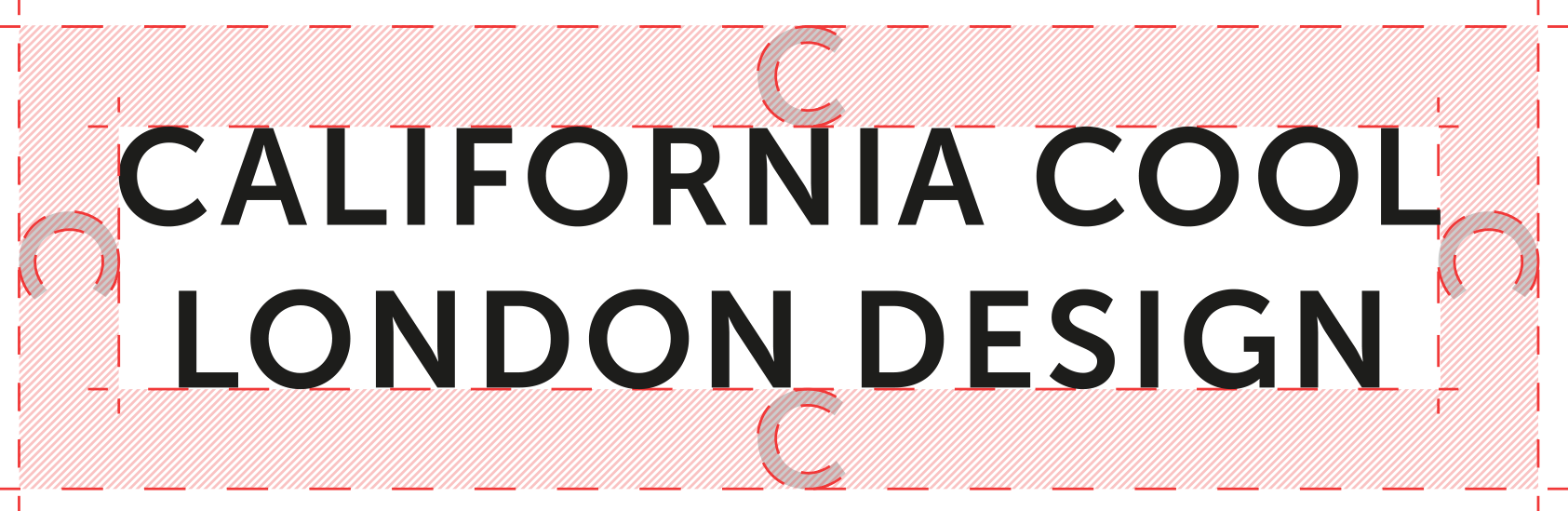
Taglines
When using our tagline as a lock up, it must be treated as a brand
asset and used with the specified clear space around the outside.
The minimum clearspace required is equal to the height to the ’C’ of
the mantra.
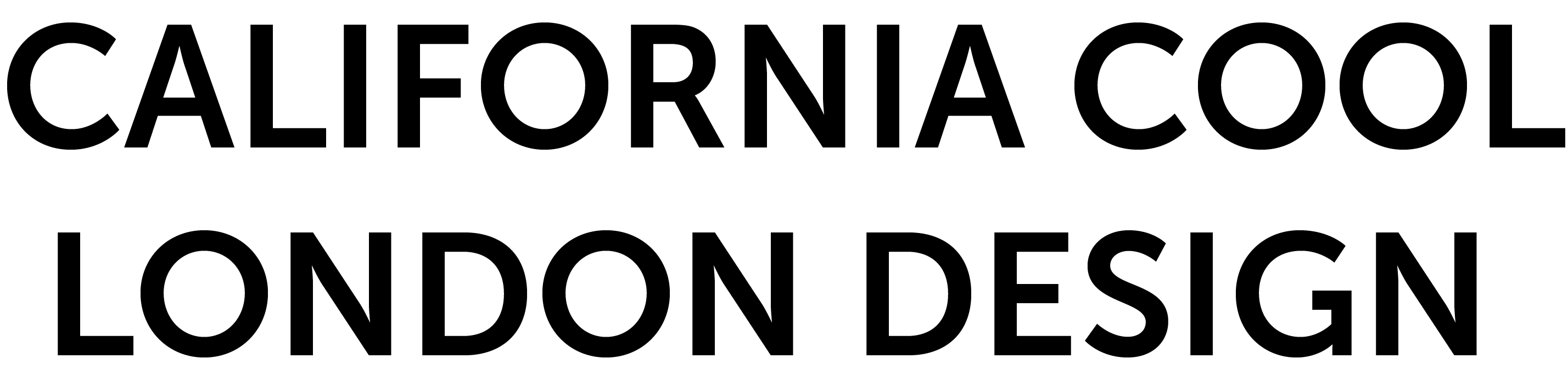
1. As a single line lock-up:
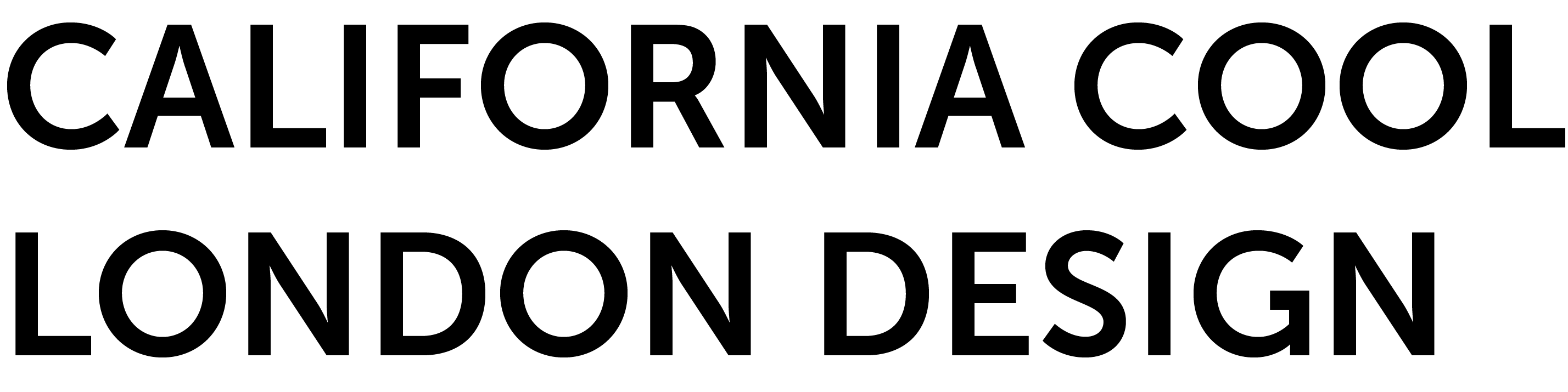
2. As a stacked lock-up, either left-aligned or centralised:
Stripes
The story behind the stripes
These stripes represent the spirit
of California, shaped by the
modernist movement of designing
freedom, particular figures such as
John Van Hamersveld, and the
carefree colourful vibe with runs
through these influences. It is the
same spirit which nurtured the
explosion of growth in the
technology coming out of
California, which has changed the
world, and now influences how
we think about the workspace today.
Three simple rules
1. Stripes always feature in order
2. Minimum of 7 stripes included
3. Shadows always present
Square
- All stripes & shadows
Square
- Bottom 14 stripes
85 x 55 (landscape)
- Bottom 9 stripes
85 x 55 (portrait)
- Bottom 14 stripes
Small
- Bottom 7 stripes (for small applications only)
Typography
Our brand typeface in Museo Sans.
It is available to purchase here: www.typekit.com/
Available in 5 different weights, each with italic variants, it is extremely versatile.
Museo Sans should be used for any and all Spacestor comms.
Primary we used the 700 weights for headlines and 100 for body copy.
However, other weights are included for instances where we need greater
variation.
Museo Sans
Characters
abcdefghijklmnopqrstuvwxyz
abcdefghijklmnopqrstuvwxyz
01234567890!@£$%^&*()
Primary Weights
Museo Sans 700
Museo Sans 700 Italic
Museo Sans 500
Museo Sans 500 Italic
Museo Sans 100
Museo Sans 100 Italic
Secondary Weights
Museo Sans 300
Museo Sans 300 Italic
Museo Sans 900
Museo Sans 900 Italic
Colours
Our colours come from the rich layering of our stripes. As such we have a wide
palette of colours. Colour is mostly used as part of the stripes, but can also
serve as useful highlights where needed.
Colour outside of stripes
Online is one such example where colour cues help people to navigate better.
Typography is kept to Black.
Where colour cues help navigation or text highlights are needed, we use this
colour.
Example - website buttons, icons, hyperlinks.
This website uses cookies to ensure you get the best experience. Find out more about cookies and your privacy
here.


