
Coworking Design Trend
The rising popularity of coworking spaces has led to establish a unique interior aesthetic for the 'fourth space'. WeWork's spaces are a great representation of this design trend.
Many more people are working as freelancers nowadays, which has led to a massive rise in the popularity of coworking spaces. Likewise, now that we settle down later in our lives, more and more of us are living in shared accommodation well into adulthood; these days we live together and we work together, and that’s changed the way we look at design. So in this blog we’d like to present a few notes on the design aesthetic of coworking spaces. To begin, we’re going to show you how WeWork’s designers create inspiring new spaces for others to create in.

WeWork: A Case Study
As one of the world’s leading provider of coworking spaces, WeWork has a carefully developed, well honed approach to the design process that makes for a great case study. For every new building they take on, designers Cindi Leung and Kimberley Kolkovich, who both have a background in interiors, begin drawing up plans before the lease is even signed. They consider the whole space from the top down, beginning with the beams, the glass and the walls and bringing in their colleague Jeremiah Britton, who has a background in graphic design and illustration, to work on the wallpapers, murals and other visuals. These three designers start with a grand vision and follow it all the way through to the furniture, the fittings and accessories and the smallest details.

One of the most important aspects of designing coworking spaces is creating social spaces where people can mingle and share ideas, and WeWork’s designers like to move these lounge areas closer to the windows so that they’re bathed in sunlight and to fill them with plants for a calming effect. However, as well as making the most of whatever natural light is available, the company also has a dedicated lighting design team, led by Jenny Werbell, Noele de Leon and Star Davis, overseeing all of its buildings around the world. Lighting really affects the way we feel and think, so, Davis explains, they’re “very focused on providing the right light for people. The right amount of light to do the task and the health implications of different spectrums and intensity of light are tremendously important.”

If you visit a few WeWork premises you’ll notice that the look can change from building to building and floor to floor to keep things from becoming boring, and yet they’re all still recognisably connected; this is a perfect example of a subject we’ve explored in another of our recent Insight blogs, on “extending the brand”. WeWork doesn’t so much have a unique design style as a unique design approach. It doesn’t keep to a rigid aesthetic but rather maintains a shared ethos: that good design should be a lived experience, one that shifts and adapts from city to city and neighbourhood to neighbourhood.

Neighbourhood Inspirations
It’s always a good idea for coworking spaces to connect to the surrounding community, whether by asking local restaurants to cater events there, or arranging special membership plans with gyms nearby, or anything else that helps to integrate these spaces in the urban fabric. Similarly, design inspiration should also come from the neighbourhood where a building is located: from its history, pop, street art, nature and more besides. It’s about highlighting the unique living culture of a place.
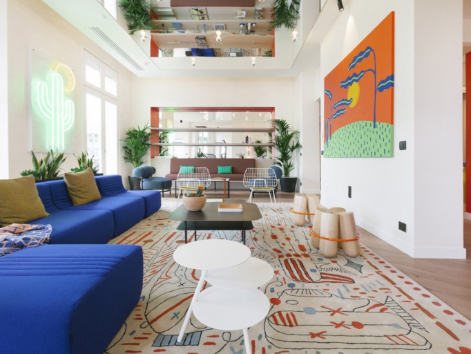
Let’s consider some of WeWork’s flagship US spaces: in Berkeley, California, Leung, Kolkovich and Britton came up with a psychedelic theme of carpets climbing the walls, tie-dye motifs and quotes from Timothy Leary, the Berkeley-based psychologist who popularised LSD. They’re always keen to preserve the history of a building so, in Manhattan’s SoHo and Meatpacking districts the original beams, exposed brickwork and old, worn-out floors were all left in place; in keeping with the “industrial design trend” that we’ve also been looking at recently.

Furthermore WeWork’s designers also like to incorporate a building’s history into their own designs: they kept the beautiful mosaic in the lobby of their Los Angeles Fine Arts Building but decided to remix it by adding a portrait of local legend Tupac Shakur. In other buildings, they’ve painted Jay-Z lyrics on the exposed concrete columns. You see, they really, really love rap music, which is inventive, urban and entrepreneurial; just like WeWork itself. “A lot of rap songs reference ‘starting from the bottom’,” explains Leung, “I think there’s a certain reference to how we cater to small startups starting from nothing and help them grow.”

Get the Look
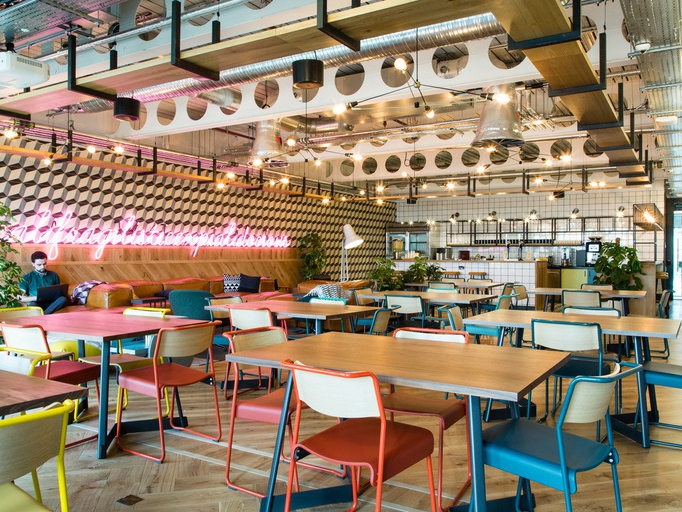
Coworking spaces have established their own aesthetic, and today all kinds of offices are designed to have a coworking feel. Some of the key features to look out for include brass fittings, glo-ball pendants or similar hanging lights, abundant planting and biophilia, artworks and graphics on the walls, and large breakout spaces with plenty of comfortable seating. As you can see, many elements of residential spaces are brought into the workplace: this is an age of coworking and co-living, and the two approaches are informing one another more than ever.

What Makes a Great Coworking Space?
So what makes a great coworking space? Clearly it’s not just the people that you meet that should inspire you, it’s also the building itself. A great coworking space should offer a wide variety of different spaces for the different kinds of work one does in the day. In order to inspire those working there, it should take its design cues from the neighbourhood and its culture; imaginative design flourishes make the space exciting and help to inspire those working around them. And, like all the best workplaces, coworking spaces need to remain agile, and to continue to grow and adapt to suit the needs of their community: “Ultimately,” says a company spokesman, “a WeWork designer’s job is about building a legacy that inspires the future.”

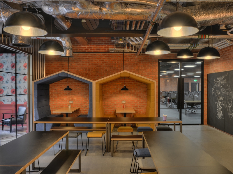
Trip.com's first UK flagship office in the heart of Edinburgh; a playful, exciting workspace designed to attract and re…
PROFESSIONAL SERVICES
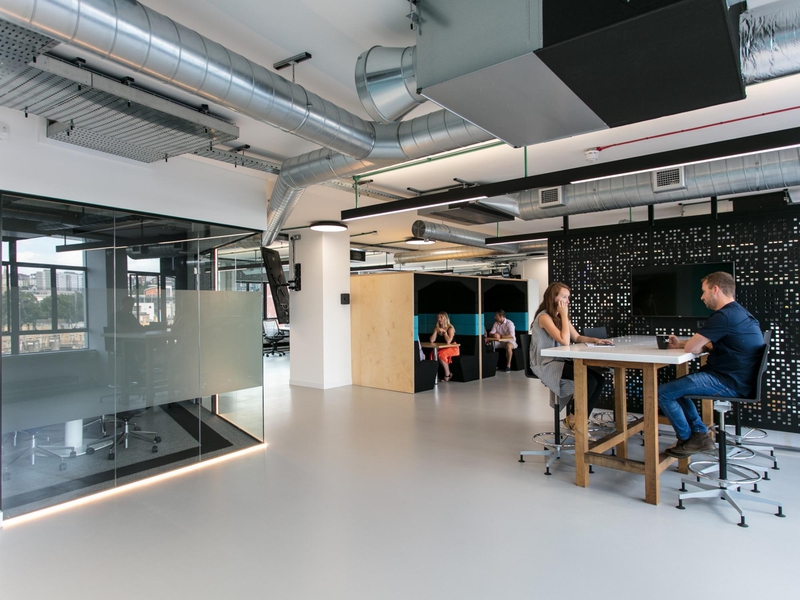
Nex's new 8,000 square foot office in Bristol leads the way for the region's booming tech industry with its dazzling, p…
TECHNOLOGY & IT
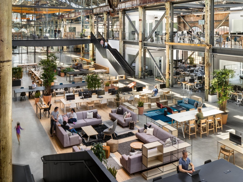
San Francisco-based startup, Gusto, working alongside world-leading architects Gensler, have created a gigantic new off…
TECHNOLOGY & IT