Oct. 26, 2017
Industry Trends
In the peaceful years following World War II, American furniture designer Muriel Coleman (1917–2003) took the simple industrial materials available at the time and used them to make a new aesthetic for the modern world. Though originally a New Yorker, Coleman settled in Oakland Hills in the Bay Area of California in the late 1940s.
Even at this young age she’d already had a rather extraordinary life. During the War, Coleman worked for the Office of Strategic Services (which would later become the CIA) interpreting aerial photographs of the French coastline in preparation for the Normandy landings. She’d also studied fine art at Columbia University, New York, and even gone to Paris and studied painting under the French cubist Andre Lhote.
From this Bohemian education came a highly innovative, creative approach to design: both in the forms she was interested in and the way she used materials. Following the War there was a shortage of traditional raw materials to work with in America; furthermore, as a young female entrepreneur starting out in a conservative era, Coleman had very limited access to funding. Rather impressively, she was able to turn these restrictions into opportunities and make the most of the simple materials at her disposal. She had a good knowledge of metalworking (her family’s business was making farm tools), and around the factories of California there was plenty of cheap metal to work with, so Coleman began to experiment with these industrial materials.

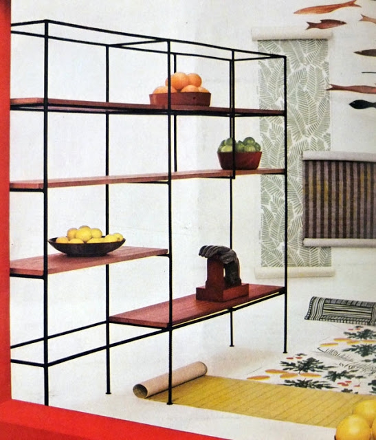
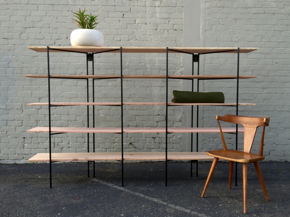
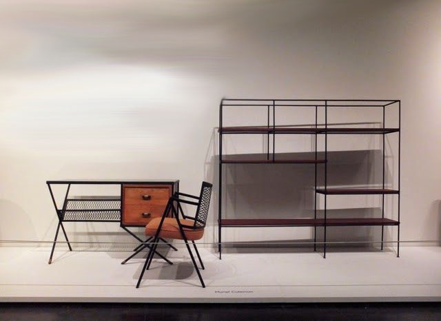
Her major innovation was turning metal rods into sophisticated, minimalist furniture designs that used much less wood than traditional methods; and her masterpieces were the shelving units she made in the early 1950s, using steel rebar for the frames and Californian wood for the thin shelves. The results were nothing less than stunning, and the way that Coleman was able to take these industrial materials and make them into objects of such lightness, with such harmonious forms, has been a huge influence on our own approach.
In many ways, Coleman’s designs predicted the trends of the future. For instance, the way that she left the functional components of her furniture exposed, and incorporated them into her designs, resulted in a deconstructed aesthetic that was far ahead of its time. Likewise, the way that she sometimes took existing furniture, or discarded rebar and mesh, and made it into unique pieces was an early example of upcycling.


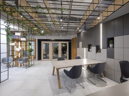
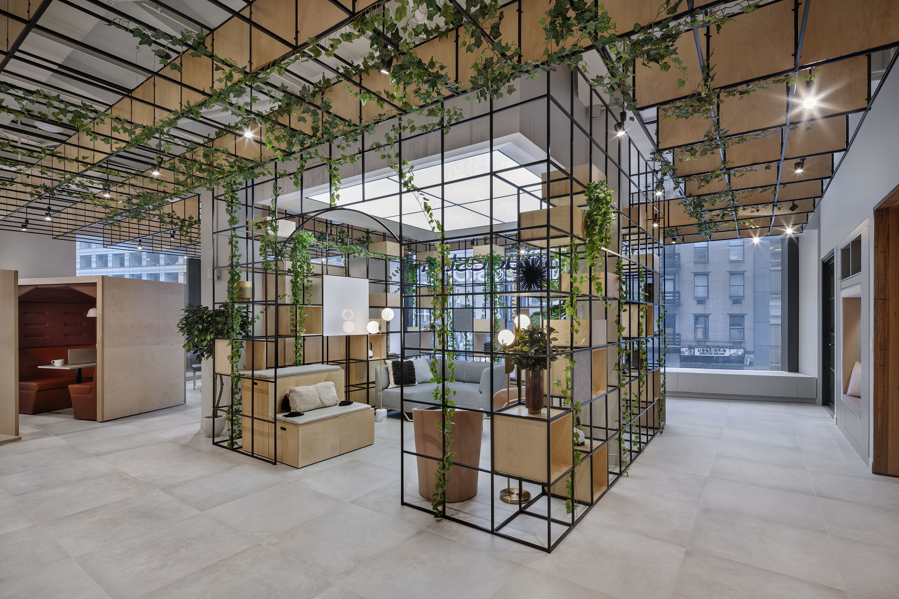
Above all, Coleman wanted her furniture to look great. Her grids bring to mind the modernist facades of Le Corbusier’s architecture, or the minimalist sculptures that would appear in art galleries later in the decade. Her shelving units were architectural features in their own right and not only did they look good, they could also be used as room dividers. As such they were an important influence on our Palisades line of modular shelving and room dividers: especially our Palisades Grid , made from metal and wood, which maintains both the lightness and the minimalism of her aesthetic.

Muriel Coleman was brilliant at making the most of her materials and also making the most of space; we’ve always admired her ability to open rooms up, and to use space in way that is both beautiful and functional. She was ahead of her time, and with the rising popularity of the mid-century modernism style, we believe her designs will live on. Follow us on Facebook , Twitter and LinkedIn to keep up to date with this design series.
Share this article

