June 25, 2018
Cool Workspaces
Il Prisma Milano were invited to capture the spirit of Martini that has been tantalising taste buds since 1847.
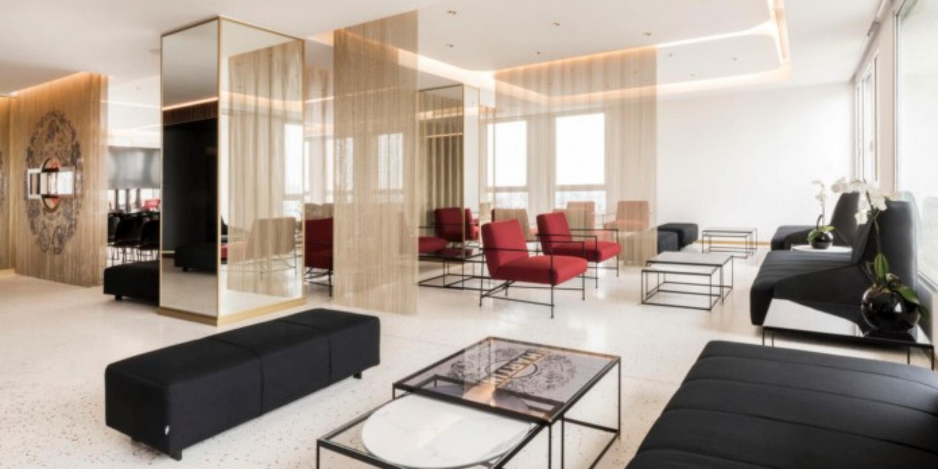
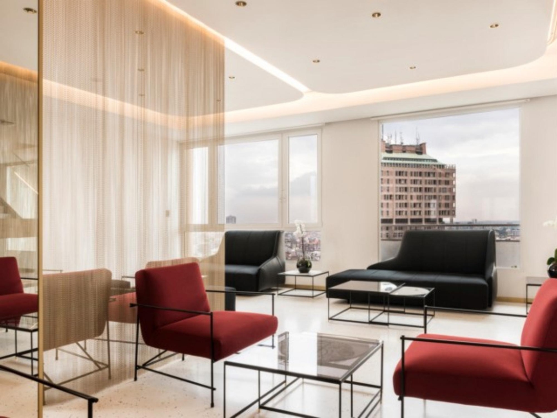
An epitome of cool, Martini’s offices needed to showcase their pursuit of excellence and flair for enriching design which is why the office could easily be mistaken for an Italian 5* hotel.
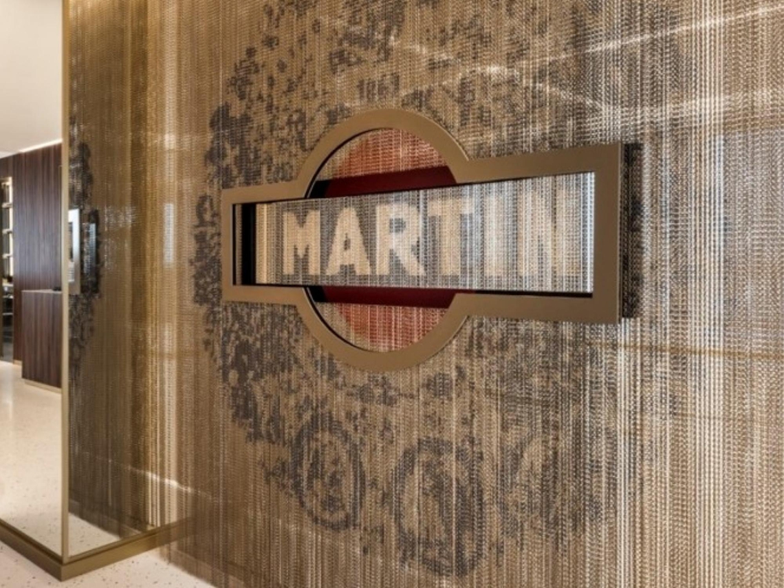
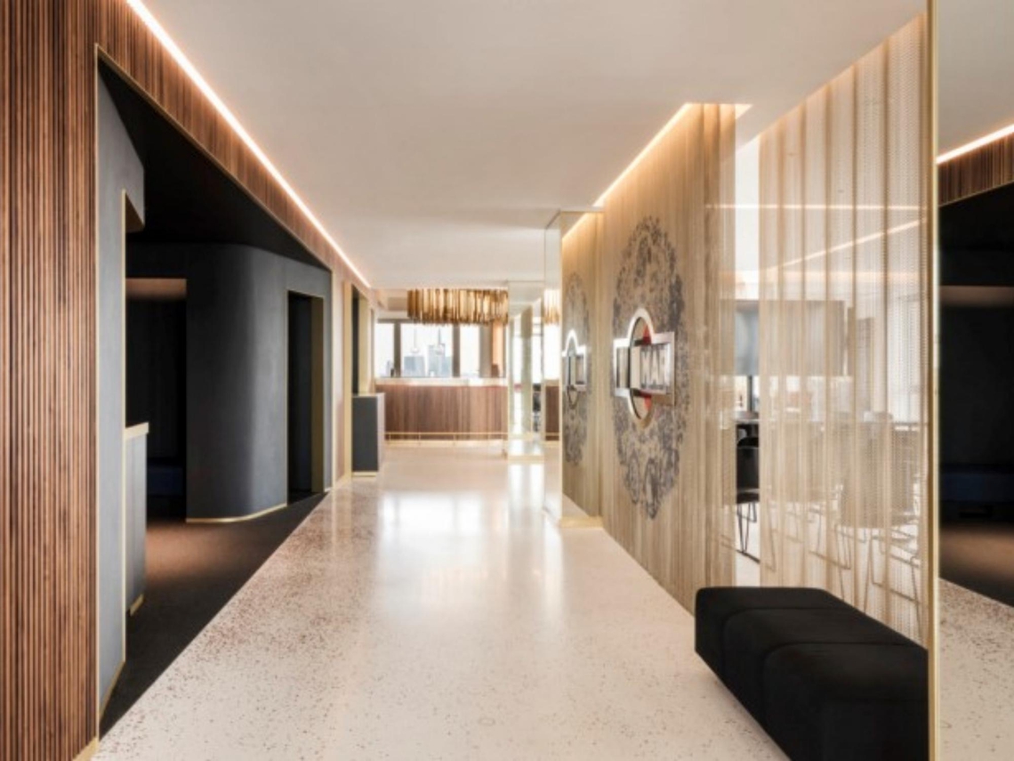
With 5 event halls spread across 3 floors, each room provides interactive walls and optical illusions to intrigue and awaken the sense. To enhance employee interconnectivity and optimise office space, there are very few static walls. Instead, flexible open and closed spaces have been created using floor to ceiling gold chains.
Synonymous with the drink, the office has a transparent theme throughout. Mirrors and reflective surfaces invite light in so that visitors feel like they have space to relax in.
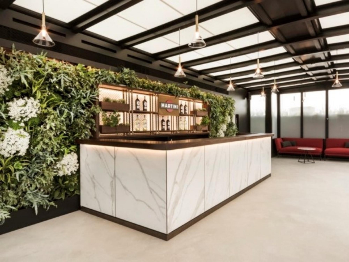
It’s this type of strategic innovation that sets it apart from so many spaces; not aiming to attract millennials or be in with this season’s interior trends, it instead uses distinguishing elements to pay homage to its heritage: Italian marble, opulent gold, glass topped tables and thin stemmed bar stools.
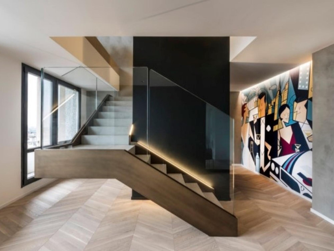
Not a single space has been neglected; the paintings surrounding the stairway wouldn’t look out of place within an art gallery. Even the lampshades around the bar are shaped like upside down martini glasses.
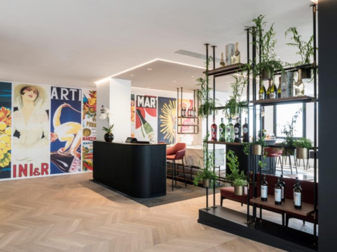
The iconic brand colours are ubiquitous: red, gold and black, symbolising parties, design, and living the good life. Vintage Martini posters decorate the walls, distinguishing elements that flash back to times gone by.
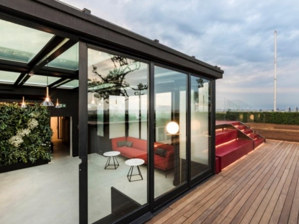
The final piece de resistance is a roof terrace, providing panoramic views of the city. Every inch of interior design reflects Martini’s brand: charismatic, sophisticated and cultured.
Share this article
