The Power of Color in the World and Workplace
Instantaneous and subconscious, color isn’t just decoration; it’s a mood-shaper, a message, and in the workplace, a tool for transformation
You feel the color. Before you notice the layout, the furniture, or the lighting, when you step into a space you feel the color. Instantaneous and subconscious, color isn’t just decoration; it’s a mood-shaper, a message, and in the workplace, a tool for transformation.
Did you know that a room painted in warm colors (reds, oranges) can feel up to 10°F warmer than one painted in cool blues or greens, regardless of the actual temperature! Or that research from the 1970s showed that a shade called Baker-Miller Pink was used in prisons to calm inmates, deterring aggression, whilst overexposure caused the opposite effect!
Nuances in hues, tones and shades play are crucial to shaping our experience - warming up a chilly office, inspiring bursts of creativity, or creating an environment where people can truly thrive.
A Colorful History
The royal Tyrian purple, made from crushed sea snails, was a rarity reserved for emperors and kings. Nelson Mandela’s vibrant batik shirts were a deliberate rejection of apartheid division, symbolizing optimism and reconciliation. Coca-Cola changed their branding to its iconic red to signify innocence and differentiation during prohibition in USA.
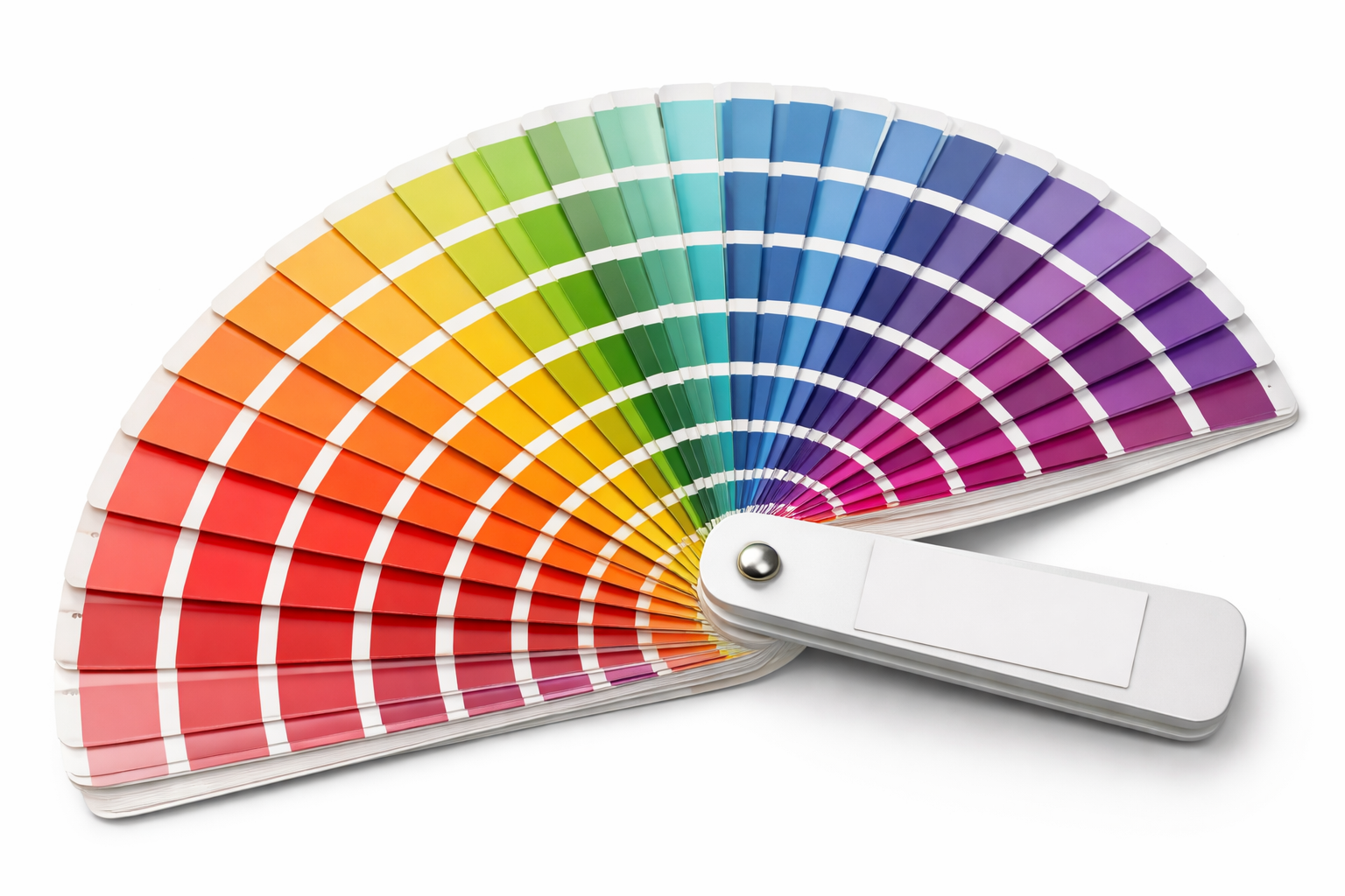
But where did the use of color start? Humans have used color as a signal, marker or art expression for thousands of years. Ancient civilisations used materials like crushed lapis lazuli (blue), red ochre (clay), and cochineal bugs (scarlet) for pigments. Synthetic breakthroughs in the 19th century invented aniline dyes, derived from coal tar, which revolutionized the availability of color in design. And in 1963, Pantone provided a universal language for color for consistencies across industries.
So, color in design isn’t new, but its creative uses continue to transform cities, implement social reform and dictate user experience.
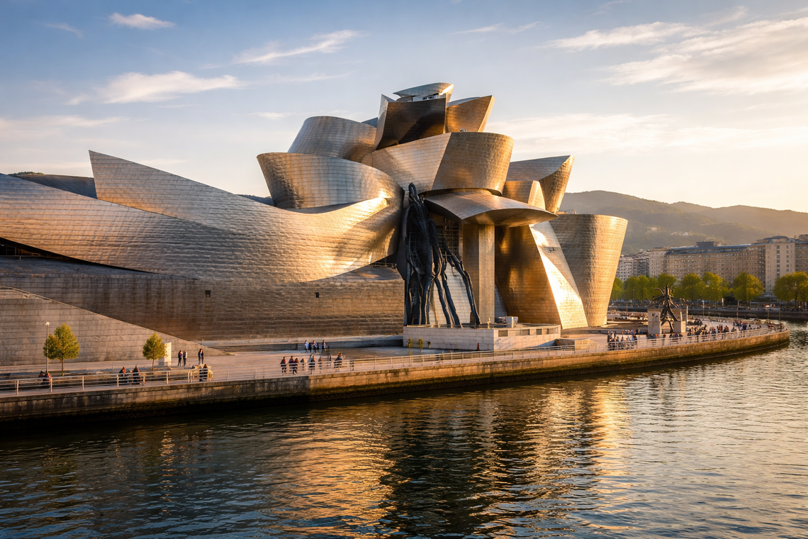
The Guggenheim Museum in Bilbao revolutionized the city not only with its striking architecture but also uses shimmering, reflective titanium panels. The panels change color subtly throughout the day, depending on the light, giving the building an ethereal, ever-changing appearance. This transformation catalyzed the city’s economic revival, a phenomenon now called the "Bilbao Effect."
In the rundown neighborhood of Kampung Pelangi, Java Indonesia, the government implemented an initiative to boost tourism and revitalise the local economy. They commissioned the village to be repainted in vivid rainbow colors. Kampung Pelangi became an Instagram sensation almost overnight, after its colorful renovation, dramatically improving its fortunes and bringing in new business opportunities.
In the workplace, color can do the same. It shapes identity, reinforces values, and fosters connections. As Morag Myerscough says, “color is used as a visual language to transform spaces, to inspire and to energize people.”
The Scientific Psychology of Workplace Color
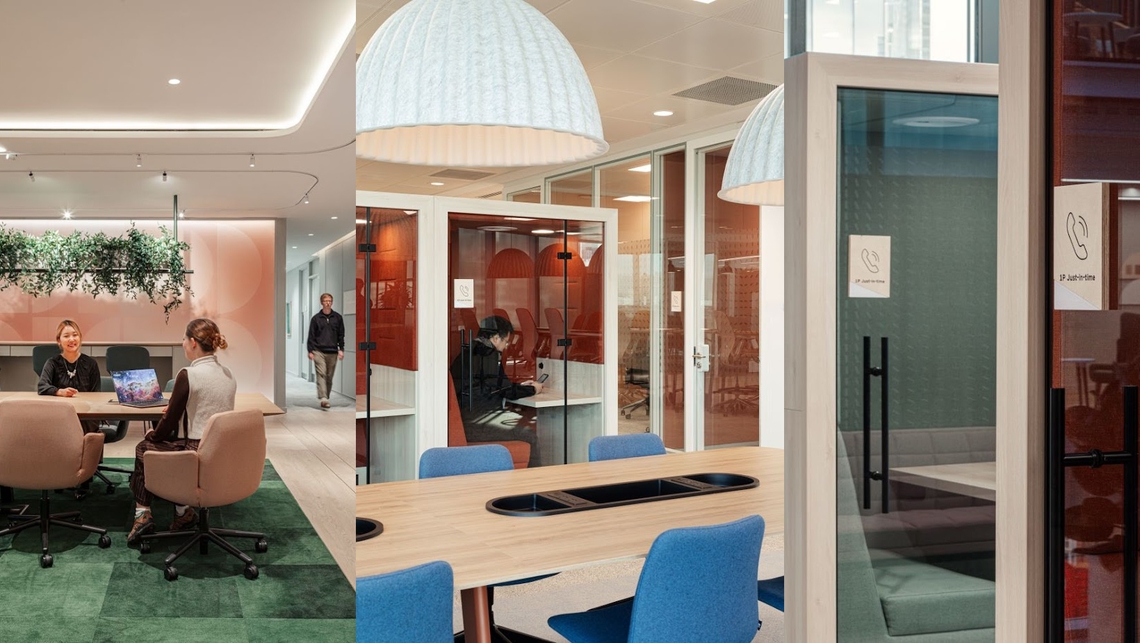
Color isn’t static; it interacts with us in unexpected ways. Studies have shown that yellow can boost creativity, making it the darling of startups and brainstorming hubs. Meanwhile, calming blues reduce stress and improve focus, perfect for coworking spaces or quiet zones. And then there’s green—the MVP of biophilic design—that evokes balance and refreshment, encouraging a sense of wellbeing in breakout rooms or communal spaces.
Providing a range of colors is also inclusive for those that are neurodivergent. Whether it’s different zones, varying in shades, intensity and tone or a space where the user can adjust lighting and color, giving employees autonomy in the environment they work in is important to manage visual triggering and different cognitive moods.
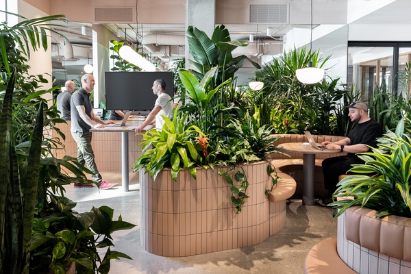
Biophilic palettes like terracotta and sage bring the outdoors in, fostering a connection to nature and boosting employee wellbeing.
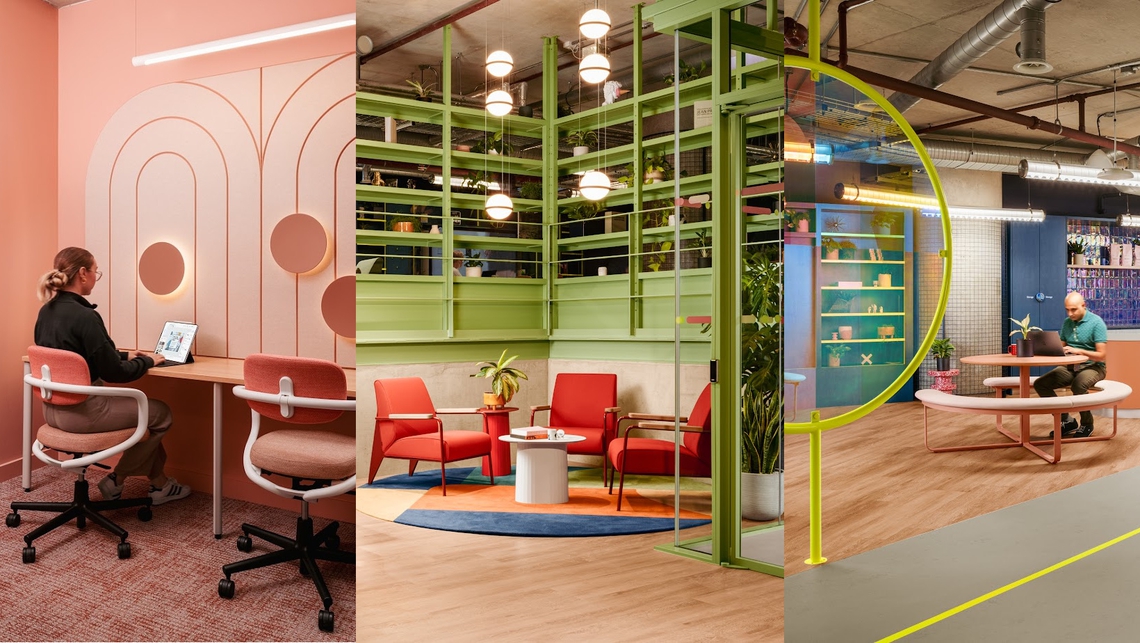
Maximalist brights—think fuchsia, electric blue, and lemon yellow—are reclaiming office spaces, energizing experiential zones and pop-ups.
Mood-responsive tech uses LED lighting to shift colors dynamically, adjusting spaces for focus, relaxation, or collaboration.
These trends aren't just pretty; they tell stories, they facilitate experiences, and they inject vivacity. As Leatrice Eiseman of Pantone puts it, “Color is life; it is as vital as breathing.”
Our Collaborations in Colour
Spacestor’s work with clients like Adobe and Chase Sapphire Lounges highlights the transformative use of color in commercial spaces. Whether it’s bold dividers or accents that reflect a brand’s energy, the result is always the same: a space that feels alive.
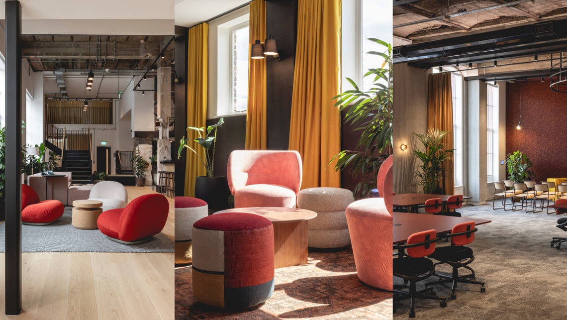
The new, Gensler-masterminded, Adobe London office has a strong colorful identity which marks the space from the bright green reception, following fluorescent yellow arrows to oases of pink, orange, teal and red.
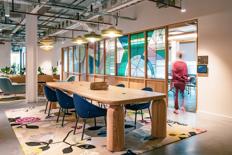
Chase Sapphire Lounges in Austin-Bergstrom International Airport reflects Austin’s pulse of boldness, eclectic shades and rich connection to nature. The lounge’s design by Corgan pays tribute to the location’s spirit through vibrant colors and art, including large glass murals of Texas wildflowers.
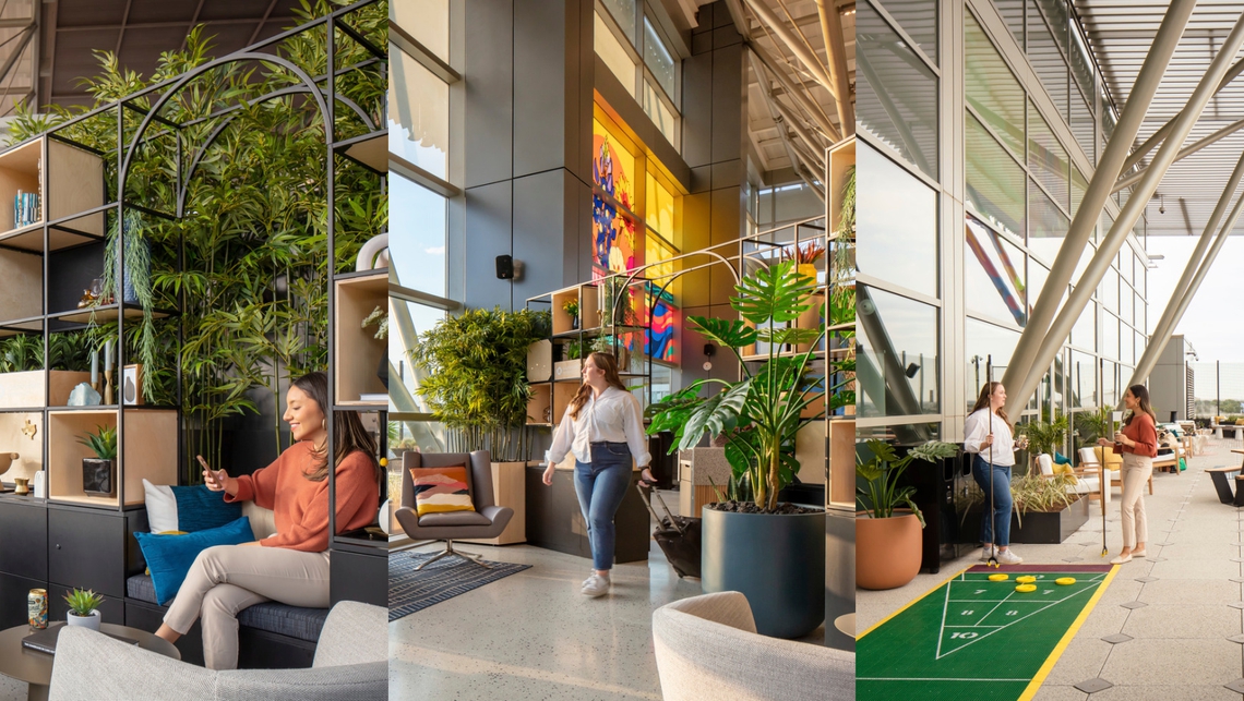
A Confidential Technology Client in Chicago, presents its signature colors through furniture and wall features, including an expansive mural, championing purple as a backdrop to a brightly colored collaboration area. Sarah Adams, Design Director at Gensler explains, “the glittering spectrum of light the city reflects served as inspiration for the color and finishes throughout the space, with architectural elements and textures seen throughout the vibrant neighbourhoods of Chicago, creating a unique human-centric experience on each floor.”
Not just an aesthetic tool – color is a means of communication. A way to influence, inspire, and invite. So, what story will your workplace tell? What heritage will it highlight and connect to? And how will you use color to transform and structure its creation? Workplaces that embrace the full potential of what color can do don’t just stand out - they create environments that connect people to spaces with indelible links. As Zaha Hadid advises, “Color is not a secondary thing for me. It’s not decoration. It is an intrinsic part of the geometry of my designs.”

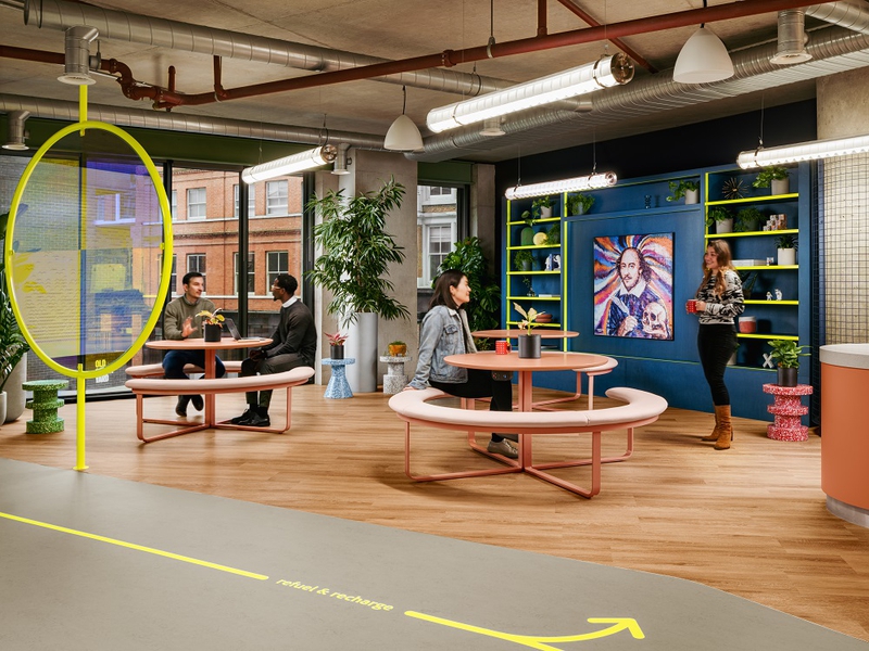
A focus to empower everyone through design and immersive experiences
TECHNOLOGIE & INFORMATIQUE
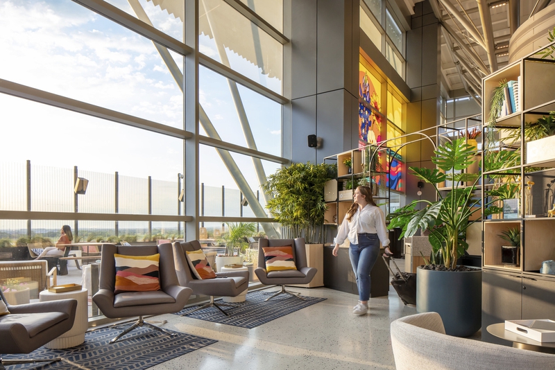
JPMC brings a whole new kind of magic to travel with their luxurious Chase Sapphire Lounges.
AVIATION
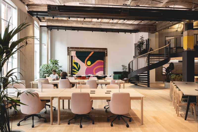
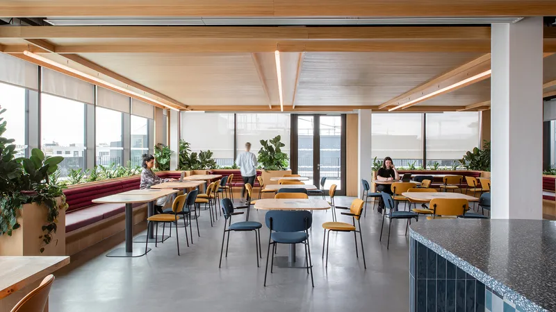
Edelman’s new home is a sustainable, socially supportive space which is highly aligned with the organisation’s brand an…
SERVICES PROFESSIONNELS