11 septembre 2023
Espaces de travail sympa
A workplace necessity which is becoming more important is the necessity of communicating the culture and identity of an organization’s brand to ensure it filters through to every team. In the words of Philippe Paré, Managing Director of Gensler France, “the office serves as a physical manifestation of an organization’s vision and mission”, therefore emphasizing the physical environment’s importance as being a catalyst for employee engagement and creating a corporate culture.
Your trusted partners will collaborate with you on the bigger more distinct choices such as the design of the space, furniture choices, architectural plans, flooring, acoustics, and lighting, which are all critical to the look and feel of the space. With so much to think about, sometimes we leave the small styling details and layering to the last minute, missing a chance to enhance the curated and aligned workplace you’ve created! Read on for our top tips and examples on how to perfect the little details and craft a workplace which sings of your company’s culture and brand!

1 - Choosing a Color Pallet
The power of color is hugely relevant in creating a workspace which manifests the organization’s mission. Strategic choices must be made on which colors to emphasize and which to tone back. The correlation between colors and the moods and actions they evoke was demonstrated in the 1920s by Wassily Kandinsky and Paul Klee, teachers at the Bauhaus (read more about them here). 50 or so years later, color psychologist Angela Wright, theorised that human brains are wired to experience light on a visual spectrum that is reflected in their behaviour, hence different colors evoke different emotions when we see them.

Considering this when choosing accessories for the workplace is a way to dial up the energy in some spaces and ensure a calming environment in others. Whilst the effect of each color is not the same in every circumstance; red is synonymous with power and driving productivity, blue signals a softer more creative atmosphere and green, a cue for recovery and calmness. When approaching your colour choices, it’s great to consider the types of spaces you are creating and the types of work that will be done in each.
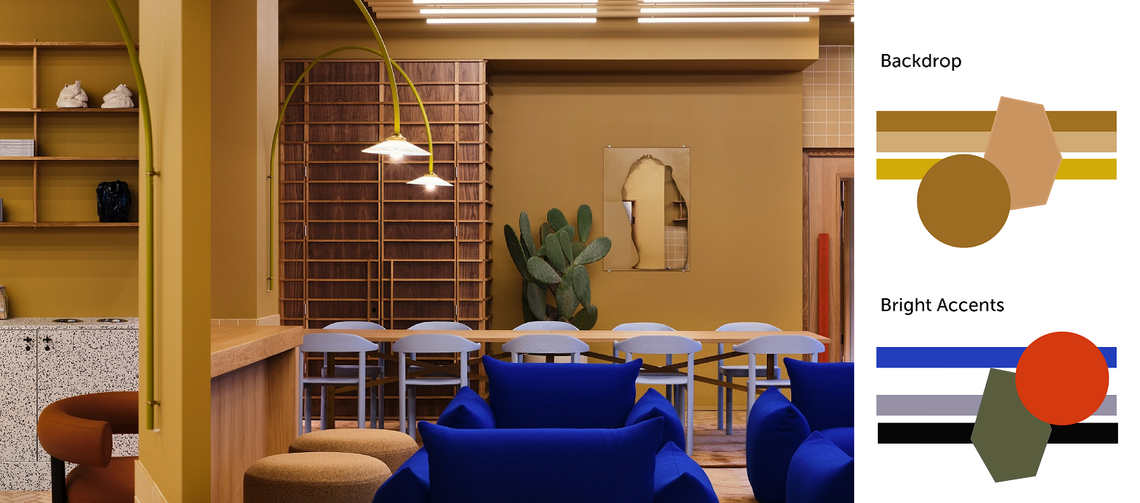
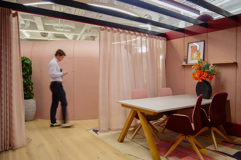
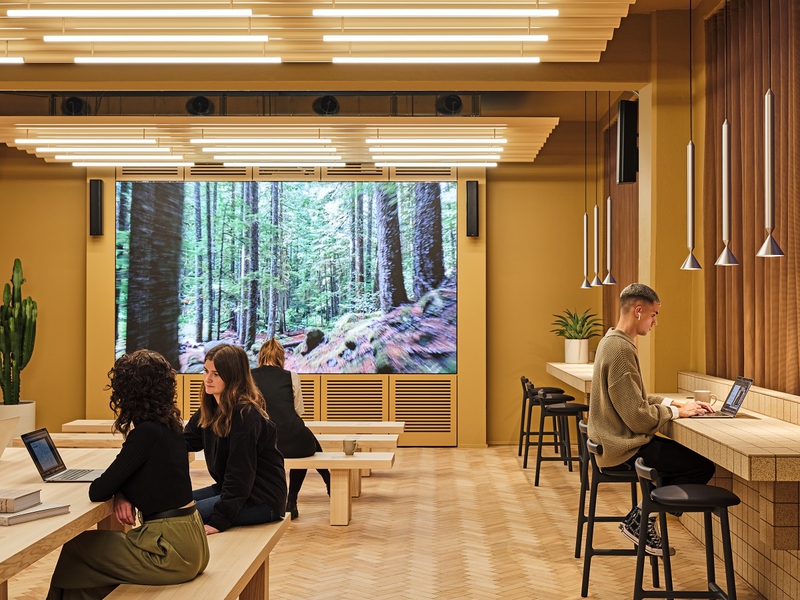
In a recent project by TOG, the cafeteria and open space were very yellow-forward in a bid to encourage collaboration and decision-making. Whilst, painting whole walls in bright colors may not be the answer for your brand as it was for TOG’s client, against a more neutral pallet, bright accents shown through ornaments can act as the small pockets of saturated rejuvenation an office needs.

2 – Understanding your Objective Style
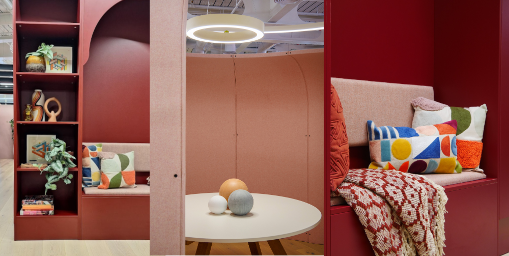
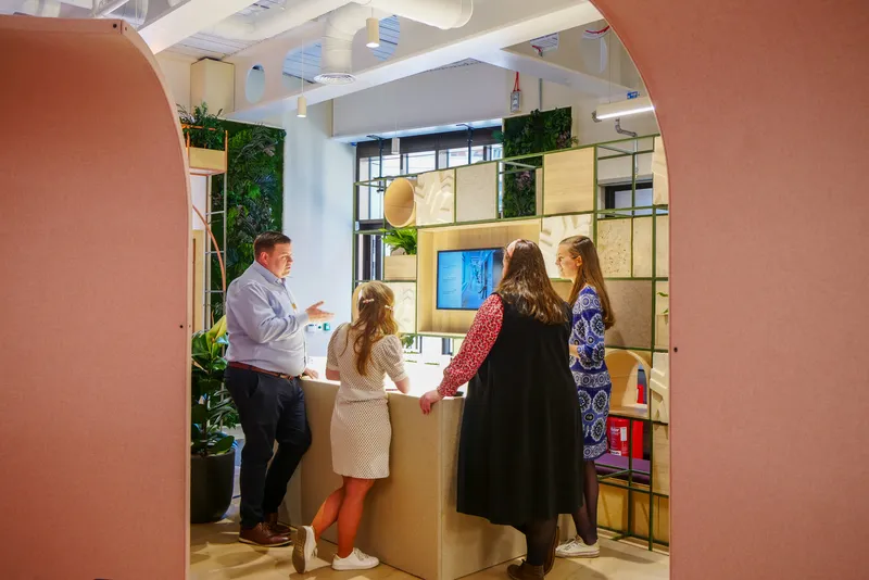
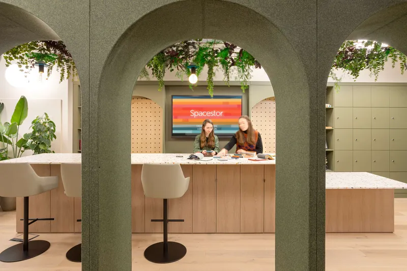
Another crucial factor to consider when finishing off your space is to take stock of the purpose of the space and what the common vision is. Whether your space is a sophisticated center for modern innovation or a more eclectic, playful space for creativity, matters and after all, the little details are what communicate a brand to both employees and customers. Todays workplace trends are steering away from straight lines and bold, arbitrary designs for softer more organic forms. Curves and arches can be incorporated into the small details to evoke a more homely feel which is especially effective when trying to attract employees back to the office.
The workplace you are designing may be defined by an era, heritage, or location. For example, during the visioning process for the design of our new London Design Centre, we took our original inspiration from the work of Californian designers such as Muriel Coleman and John Van Hamersveld and incorporated this influence through small touches of strong colour, mid-century decorative shapes and the use of natural woods.

3 – Embracing Textures & Sustainable Materials
Many projects have sustainability goals and aimed-for accreditations, but one challenge many teams are facing is moving this away from a box-checking ritual and ensuring that the sustainability of the space holds meaning for employees. Using materials, furniture and fittings which are sustainable in both ingredients and manufacturing process are crucial parts of the process, and a way to go further with this is to incorporate socially and environmentally sustainable items into your accessories and furnishings.
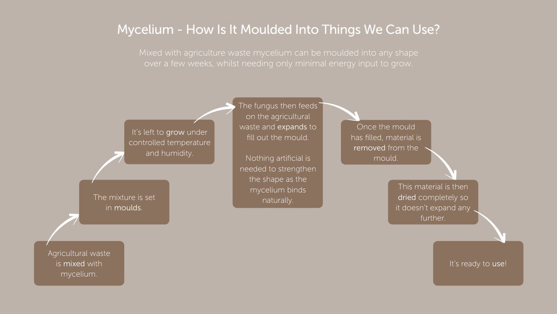
A recent example our research and development team have been looking into is the possibilities that lie in mycelium. Mycelium is made from mushroom spores, which can be mixed with agricultural waste to create a one hundred percent bio-degradable, fire-retardant, and acoustic material. It is easy to grow into any customizable mold, and we have already shared a concept accessory panel to be inserted into our Palisades products with both the UK and US market with great success. In a recent discussion with Kim Le Geyt, WTW and Naomi Sakamoto, Gensler, the experts spotlighted some great examples of other sustainable materials with huge potential for workspace, including Organoid, a German manufacturer creating surfaces made out sustainable materials such as wild flowers and moss.

Buying accessories from local manufacturers is an effective way to give back to the community your workplace is a part of. As Jack Pringle, MD of Studio Pringle, framed it in a recent discussion, it’s time for buildings to “become good corporate citizens”, highlighting the benefits workplace projects have on their local community, both through economy in the building stages, but also throughout its living-in tenure. Retailers selling one-of-a-kind ranges and items authentic with the local region are numerous in lots of communities and paying homage to these small businesses can be a way to engage employees with the local area.
4 – Encouraging Personal Touches
The small detailing can be a meaningful way to represent an employee’s identity; affording autonomy to them around their working environment enables them to create a space which has more attraction and is more relaxing to be in. This may include bringing items in from home, including decorations which align with hobbies or preferences and sharing your design ideas with the team and gathering feedback to inform your choices. Giving employees opportunities to take part in this process will also benefit employees that may be neurodiverse who may appreciate the familiar comfort of certain furnishings and autonomy to create their own environment.
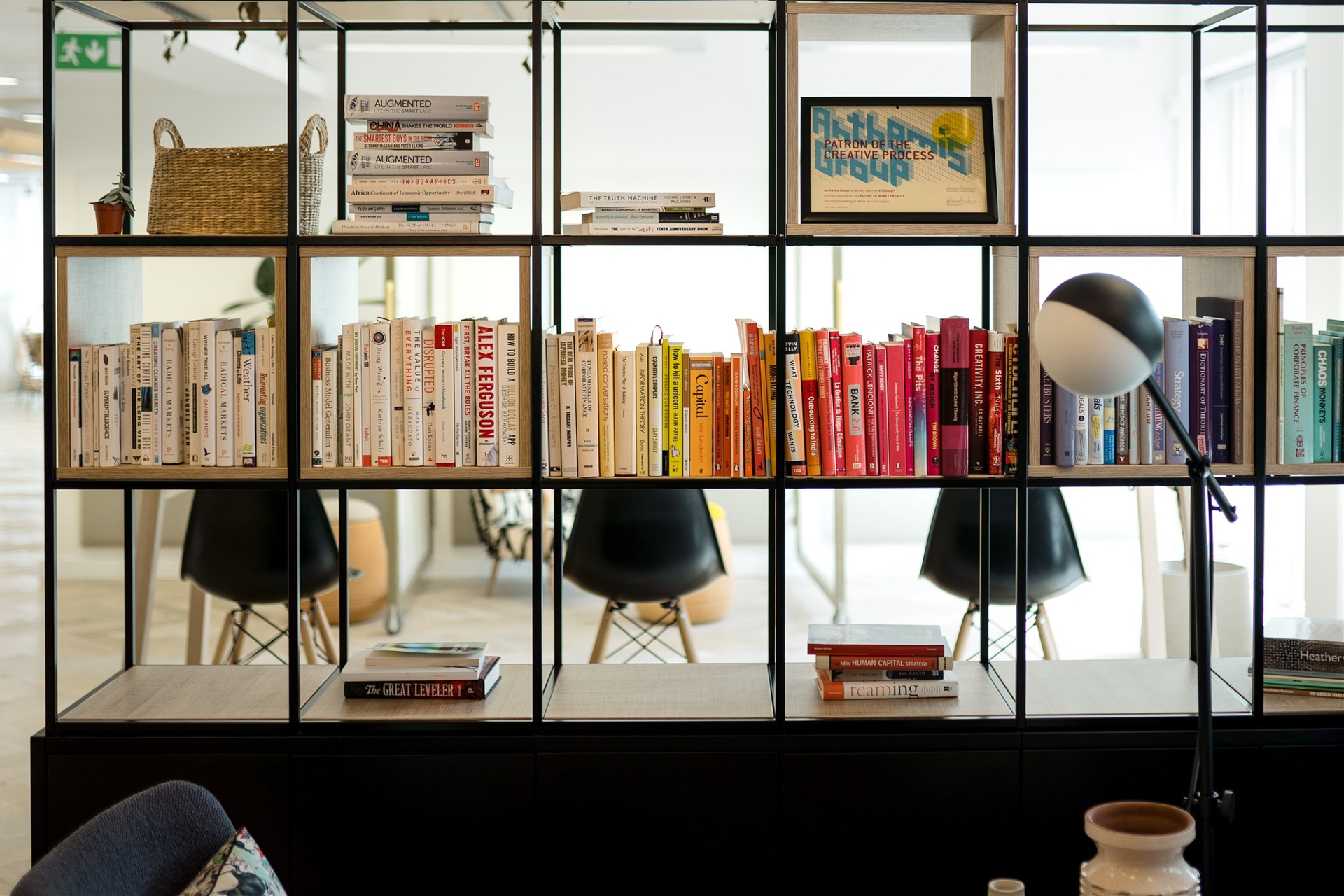
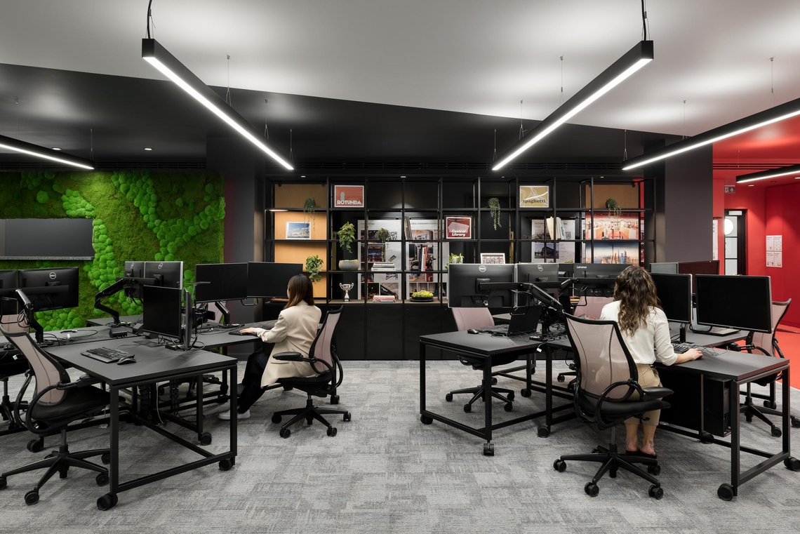
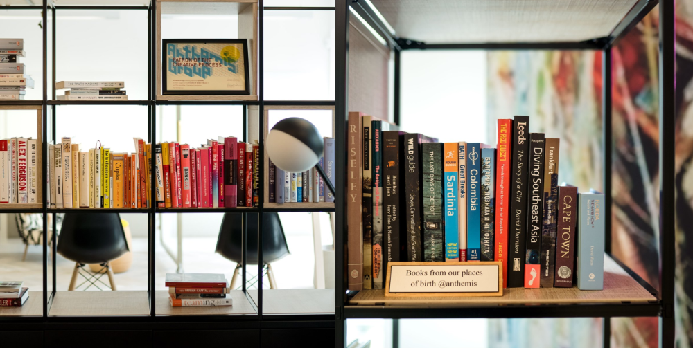
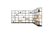
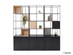
In collaboration with Anthemis, a global financial company, we provided our Palisades II which was accessorized with a library of books from employees’ places of birth. This thoughtful take on a personal touch helps to make people feel heard as well as giving colleagues an insight into each other’s lives, enabling stronger relationships throughout the team.

5 – A Balanced Arrangement
Whether you’re working with multiple wide shelves or a small alcove, it’s important to understand how to place your items to most effectively display the curated pieces you’ve chosen. Here are some tips to arranging the perfect display:
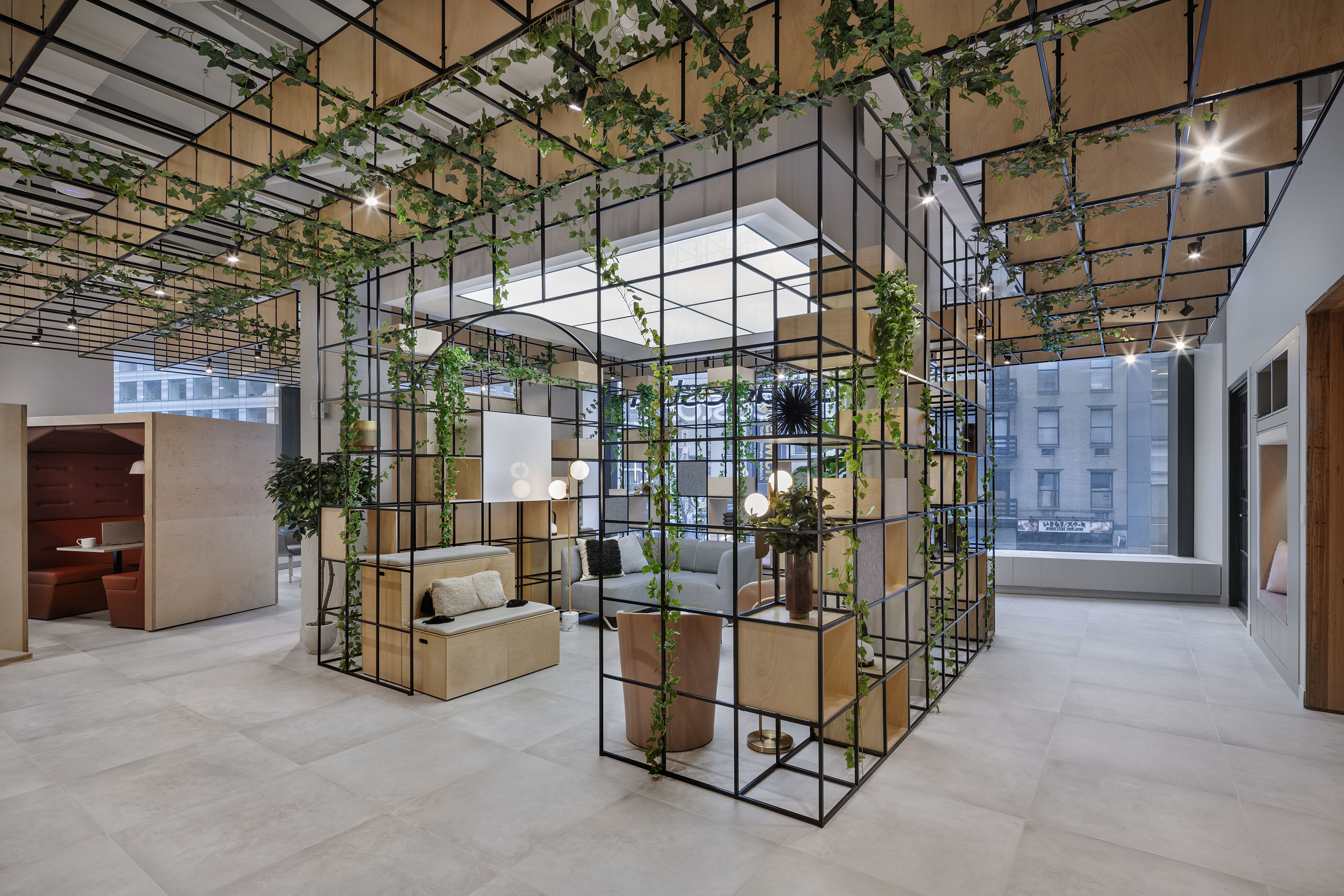
Play with height and depth. Choosing items which are of varying heights adds interest and enhances the aesthetic. It’s also important to remember that the display will be seen from different angles so remember to test different perspectives of the shelf. It is also important to create layers by overlapping. Don’t be afraid to overlap items as this will adddepth to the arrangement, enhanced further if you mix and match textures and tones.
Play with plants, books, and artwork. These three items are pillars when balancing a display. Plants and flowers add life and natural color, as well as fluid shapes which are great to enable transitions between different shelves or within vignettes. Books bring warmth and interest and can be used as risers to add height to other items. Artwork can say a lot about the style you are looking to achieve and adds thought-provoking interest as a backdrop for your curated items.

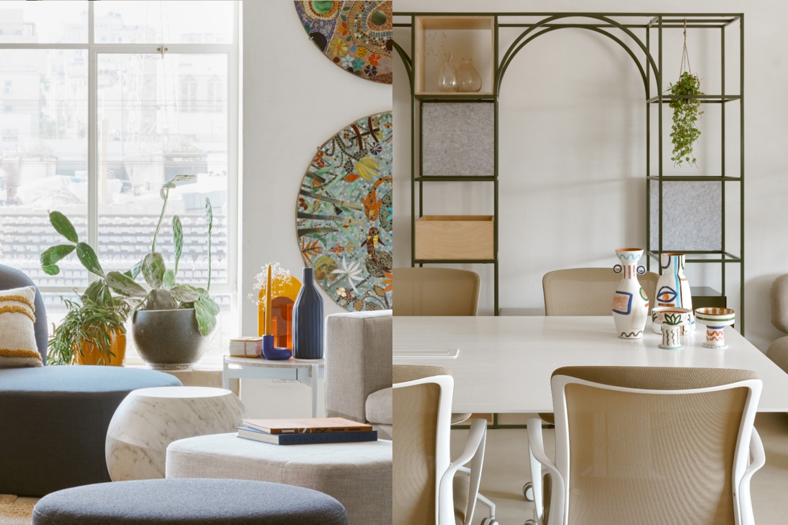
Create vignettes with an odd number. Grouping with an odd number of items is more pleasing to the eye and drives a naturally balanced look. Vignettes are a great way to approach a longer shelf, and our eyes are naturally drawn to triangles so arranging in a rough triangle is a great idea. A stunning example of aligned and perfectly curated vignettes were featured in our recent partnership with Waxman when creating a showroom in the heart of Tel Aviv. Against a very muted and peaceful backdrop, items with pops of color and authentic soul are displayed to perfection.
If you are looking for a starting point on a group of shelves start on the top shelf filling up much of the space. Then move on to the shelf below create vignettes or groups of items making sure to leave significantly more white space in between each group. Alternate as you go down the shelves for stunning display which is impressive and draws the eye up.
6 - Add Spacestor's Accessories to Your Workspace
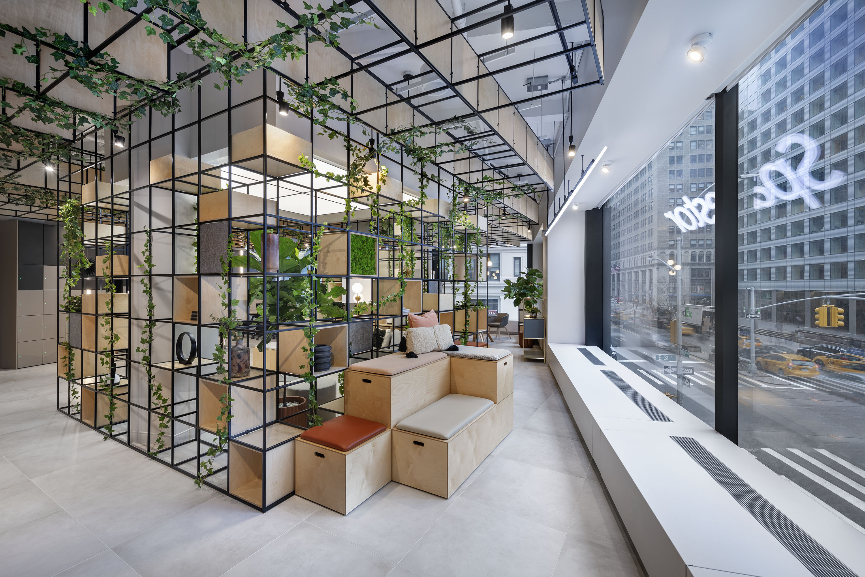
- Unveiling a testament to beauty, nature, and inspiration! As a catalyst for the profound effect of natural light, Prism Glass Panels bring the workspace to life with warm radiant distortion, unique to this special Spacestor accessory.
- A game-changer in sustainable innovation with reputable credentials! Created from two simple ingredients - local agricultural waste and mycelium, the Mycelium Panels boast a remarkable sound absorption across a wide range of frequencies, are entirely degradable and a natural fire-resistant barrier through a network of interwoven filaments.
- Bringing a much sought-after softness to hard lines! With a strong association to Spacestor’s design history, Curved Plywood accessories focus on the resi-mercial trend, blending home and work, in the workplace today.
Learn more about our accessories here!
And a final tip: don’t overthink! Think less, and go with the flow, trusting your instinct when placing your items. Chances are, you know what looks great and you can envision what you would like to create, so go with your gut and take your workspace to the next level!
Partager cet article
